Voxeon Communications
Turning a whispering PR brand into one that shouts
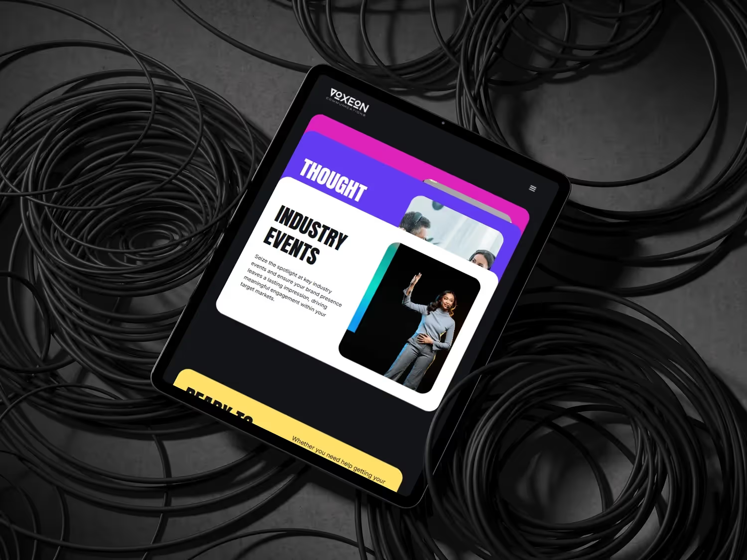
Industry
Public Relations
Timeline
4 weeks
Services
Web Design, Webflow Development, CMS Architecture
Overview
Voxeon had a strong visual identity — dark palette, bold typography, purple accents — but their site wasn't using any of it to its potential. The messaging was cautious, the layout safe. For a PR agency whose product is powerful communication, that disconnect was actively costing them business.
The Challenge
Voxeon's fractional PR model — their key differentiator — wasn't explained on the site. Prospects arrived at meetings confused about what they were buying. The 'good guys' positioning wasn't visible, and the visual identity had implementation issues: poor contrast ratios, overused accent colour, inconsistent typographic hierarchy.
Our Approach
I ran a forensic audit of the existing brand implementation, fixed contrast ratios throughout, and reserved the purple accent for specific functions only — CTAs, key data, selected emphasis — restoring its visual significance. I gave the fractional model prominent homepage placement with a plain-language explanation, and structured the CMS for easy content publishing.
Led by me, Russel Davis, as a B2B Webflow studio — delivered with my specialist network, shipping brand-led builds with AEO baked in.
Results
Here's what the engagement delivered — measurable outcomes that speak for themselves.
Meeting Quality
Prospects pre-informed
Client Self-Selection
Right-fit inbound up
Publishing Cadence
Monthly → Weekly
Build Time
4 weeks
Frequently asked questions
Common questions about the Voxeon Communications project.
More work
View all case studies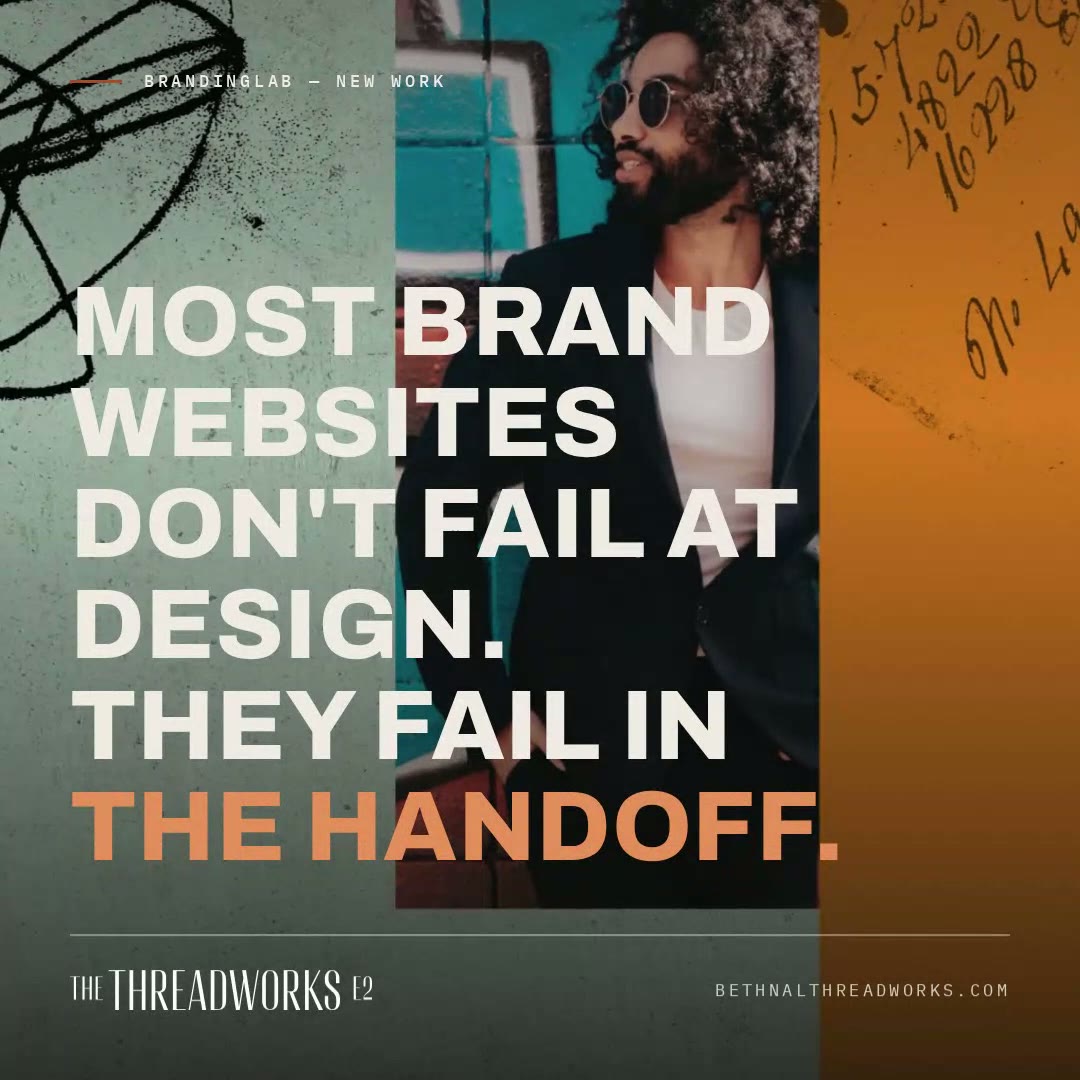
Threadworks
21 warehouse homes in Bethnal Green — Capri's design intent, translated one-to-one into a Webflow site the sales team can run.

Gazette Search
SA Government Gazette intelligence platform — 900,000+ notices searchable by ID number in seconds; bulk-screens 50,000 IDs in under 60 seconds.
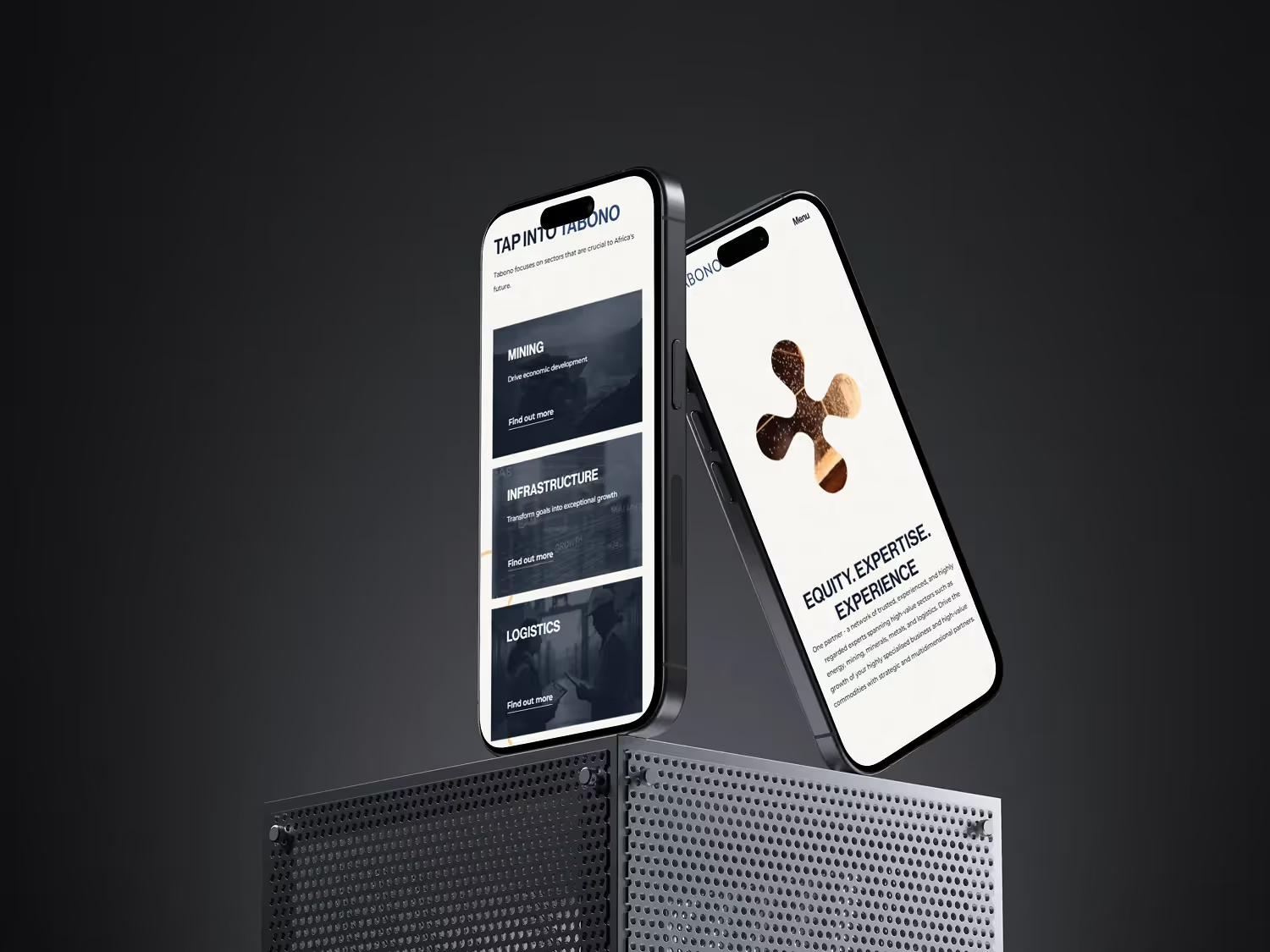
Tabono
20+ page industrial website built in 3 weeks for a conference launch
Want results like these?
Let's discuss how I can build something exceptional for your brand, delivered with my specialist network.