Introduction
What does a value creation firm actually do — and how do you show that on a website?
Mind Ventures is a value creation firm — a category of business that sits between pure investment and active management, working directly with portfolio companies to build and realise value over time. It's a sophisticated offering that requires a sophisticated audience to understand it, and a website that can communicate it without over-explaining.
When Mind Ventures approached BrandingLab, the brief wasn't just "build us a website." It was: take everything we are — our approach, our philosophy, our positioning in the market — and find a way to make that legible online. To high-net-worth clients. To founders considering a partnership. To institutional investors evaluating the firm.
That's a brief that requires time to do properly. We took four months.
Why did this project take four months?
Four months for a website is unusual. It's the right timeframe when the brief requires genuine discovery — when you can't start designing until you understand what the client actually does, who they do it for, and what makes their approach different from the twenty other firms who would describe themselves similarly.
For Mind Ventures, the discovery phase alone took several weeks. We needed to understand the firm's investment thesis, the profile of the founders and operators they partner with, the psychological profile of their ideal client, and the competitive landscape well enough to design something that stood apart from it.
What we built in response was a site that doesn't just describe Mind Ventures — it demonstrates how they think.
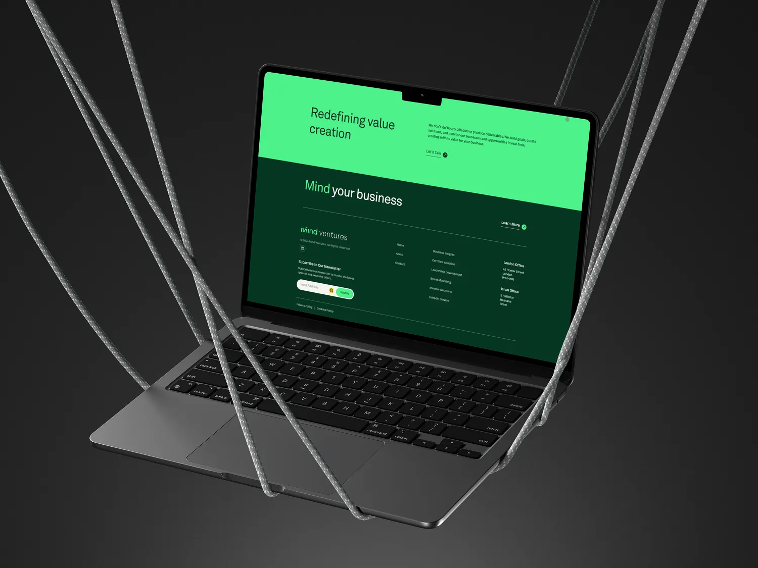
Project: Mind Ventures — full brand expression and Webflow development
Duration: 4 months
Deliverable: Custom Webflow website with GSAP animation system
Live: gomindventures.com
The Challenge
What are the specific design challenges of a financial services website for sophisticated clients?
Financial services web design has a failure mode that's easy to fall into and hard to recover from: it looks like every other financial services website. The same stock photography of confident professionals in glass-fronted offices. The same abstract language about "creating value" and "delivering outcomes." The same navy and grey palette.
For Mind Ventures, this failure mode was particularly dangerous because their clients — high-net-worth individuals, sophisticated investors, experienced operators — are pattern-matching for exactly this kind of genericness as a signal that the firm doesn't have a differentiated point of view.
The specific challenges stacked up:
Communicating complexity without jargon. Value creation as a discipline involves concepts that most visitors won't fully understand on a first read. The site needed to communicate the firm's sophistication to people who understand it, while not alienating people who are just beginning to evaluate whether Mind Ventures is relevant to them.
Building trust before the first conversation. In financial services, the website's primary job isn't conversion in the traditional sense — it's qualification. The right visitors need to leave the site confident that Mind Ventures is worth a call. The wrong visitors shouldn't get that far. That requires precision in how the firm positions itself, what it says, and what it conspicuously doesn't say.
Animation as signal, not decoration. Mind Ventures wanted animation. The risk with animation in financial services is that it reads as trying too hard — as a firm overcompensating for a lack of substance with visual noise. Every animation choice needed to serve the brand's authority rather than undermine it.
A design system that survives the team. After four months of development, the site couldn't be fragile — dependent on a designer being involved every time the team needed to update content. The architecture needed to be robust enough that Mind Ventures could maintain it independently.
Why do investment and value creation firms struggle to differentiate online?
The fundamental problem is that financial services language is inherently abstract and convergent — everyone talks about "creating value," "long-term relationships," and "aligned interests" because these are the actual things that matter in the sector. Differentiation can't come from the language alone. It has to come from design specificity, editorial confidence, and the willingness to be clear about who you're for and who you're not for. Most firms aren't willing to make those calls publicly. The ones that are stand out immediately.
Our Approach
How do you build a GSAP animation system that serves a financial services brand?
The animation brief for Mind Ventures required solving a specific tension: the client wanted motion and visual dynamism, but the brand demanded authority and restraint. The answer was to use animation to reveal rather than to impress — to use motion as a way of guiding the reader's attention through information rather than as a display of technical capability.
We built a custom GSAP animation system with several distinct components:
Scroll-driven text highlighting — key phrases and concepts fade from muted to full opacity as the reader scrolls through them, creating a sense of the site responding to the reader's attention without anything moving aggressively.
Entrance animations on section headings — characters split and fly in with staggered timing on scroll, creating visual interest at exactly the point where the reader is transitioning between sections.
Subtle parallax on hero elements — background layers move at different scroll speeds, creating depth without distraction.
Hover interactions on navigation and CTAs — responsive to cursor movement in ways that feel crafted rather than template.
The test for every animation was simple: does this make the content easier to engage with, or is it happening for its own sake? Anything that failed that test was removed.
What did the four-month discovery and design process actually produce?
The extended timeline produced something that a standard six-week project can't: a genuine understanding of how Mind Ventures thinks, expressed in a design system that is consistent with that thinking at every level.
The typographic hierarchy was built to mirror the firm's intellectual approach — clear and accessible at the top level, progressively more detailed as the reader goes deeper. The photography direction avoided generic financial imagery in favour of abstract compositions that communicated precision, focus, and long-term thinking without being literal about it.
The content architecture separated three distinct visitor journeys: founders evaluating a potential partner, investors evaluating the firm, and operators considering whether Mind Ventures's approach matched their own. Each journey had a clear path through the site without the paths conflicting with each other.
How was the Webflow build structured for long-term maintainability?
After four months of work, the last thing Mind Ventures needed was a site that required BrandingLab to be involved every time they wanted to update their team page or add a new portfolio company. The Webflow architecture was built around a CMS structure that gave the team full editorial control over the content that changes regularly — team bios, portfolio entries, news and insights — while protecting the design integrity of the sections that should remain stable.
The GSAP animation system was hosted externally via GitHub and served via jsDelivr CDN, meaning that animation updates could be made without touching the Webflow build itself. The entire animation architecture used data attributes rather than class-based targeting, making it robust against accidental class changes during routine CMS updates.
Results
What changed for Mind Ventures after launch?
The measure of a financial services website isn't traffic or time-on-site in the conventional sense — it's whether the right conversations start differently. For Mind Ventures, the shift was in how prepared prospects were before initial meetings.
Before the site, introductory conversations typically required significant time establishing what the firm does, how it differs from traditional investment firms, and why its approach to value creation is distinct. After launch, that groundwork was arriving with prospects before they got on the call. The site was doing the positioning work that had previously been done in person.
The animation system in particular received consistent notice — not as a flashy element, but as something that made the experience of reading the site feel considered and intentional. That was the intended effect. When animation is done correctly in a context like this, it doesn't announce itself. It makes the content feel more worth reading.
What does a 4-month project timeline produce that a 6-week project can't?
Time produces depth. In a six-week project, the design is responding to what the client says about themselves in the first few meetings. In a four-month project, the design has time to be tested against reality — against the actual language the firm uses with clients, against the objections prospects raise, against the competitive landscape as it evolves.
The Mind Ventures site is the result of that extended dialogue. Every design decision was interrogated against the question: does this accurately represent how the firm thinks and operates? The answer to that question changes as you understand the firm better. Four months gives you enough iterations to get to a site that the firm can point to and say: that's us.
FAQ
How long should a financial services or investment firm website take to build?
A well-resourced financial services website with a standard scope typically takes six to ten weeks. Projects like Mind Ventures that involve deep brand discovery, custom animation systems, and multiple distinct visitor journeys take three to four months. The extended timeline isn't inefficiency — it's the investment required to produce something that genuinely differentiates a firm in a sector where most websites look the same.
What GSAP animations work for financial services brands?
The most effective GSAP animations in financial services contexts are those that reveal rather than distract — scroll-driven text highlighting, controlled entrance animations on headings, and subtle parallax effects. Anything that moves aggressively or unpredictably reads as trying too hard in a sector where authority comes from restraint. The test for every animation: does it make the content more engaging, or is it happening for its own sake?
How do you communicate complex financial services clearly on a website?
The most effective approach separates layers of complexity. The top layer — headlines, hero copy, navigation — should be immediately comprehensible to any intelligent visitor. Each subsequent layer can be more specific, using language that rewards closer reading. This means a casual visitor understands what the firm does, while a sophisticated evaluator finds the depth they need. Most financial services sites fail because they try to address the sophisticated evaluator first, losing everyone else.
What does a Webflow CMS structure look like for an investment firm?
An investment firm's Webflow CMS typically needs three core collections: a team collection (bios, photos, credentials), a portfolio collection (company name, sector, stage, description), and an insights or news collection (articles, market commentary, announcements). These cover the content that changes regularly. Everything else — the firm's thesis, approach, and positioning — lives in static page sections that the design protects. This separation gives the team editorial independence without risking the design integrity of the brand-critical sections.
How do you build a website that works for multiple sophisticated audiences simultaneously?
The answer is architecture, not copy. You can't write a single paragraph that works equally for a founder evaluating a potential partner and an LP evaluating a fund. But you can structure the site so that each audience type has a clear, unambiguous path to the information most relevant to them — without those paths conflicting or the navigation becoming cluttered. For Mind Ventures, that meant three distinct entry points with different primary messaging, each leading to shared supporting content accessed from different directions.
More Cases
Web DesignWebflow
Voxeon Communications
PR agency website positioning Voxeon as the go-to for ambitious brands.
Web DesignSaaS
GiverLink
Modular fundraising SaaS platform for nonprofits, schools, and faith communities.
Email us
hello@brandinglab.io
SAY HI
© 2026 Brandinglab
Work
Webflow Agency
Startups
AEO Services
Articles
FAQ
<path d="M22.3328 7.11175C22.348 7.32494 22.348 7.53817 22.348 7.75136C22.348 14.2539 17.3988 21.7463 8.3531 21.7463C5.56629 21.7463 2.97748 20.9391 0.799805 19.5382C1.19576 19.5838 1.57643 19.5991 1.98762 19.5991C4.28707 19.5991 6.40385 18.8224 8.09421 17.4976C5.931