Introduction

What does it mean for a PR agency's website to whisper when it should be shouting?
"We help the good guys get heard." That's how Voxeon's founder described the agency in their first meeting with BrandingLab. It's a line that does exactly what a positioning statement should: it's specific, it implies a point of view, and it tells you immediately who Voxeon is and isn't for.
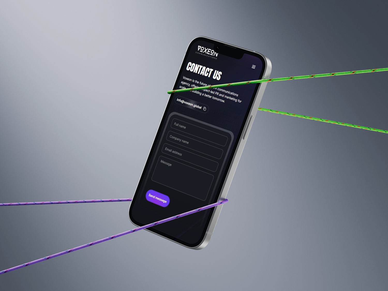
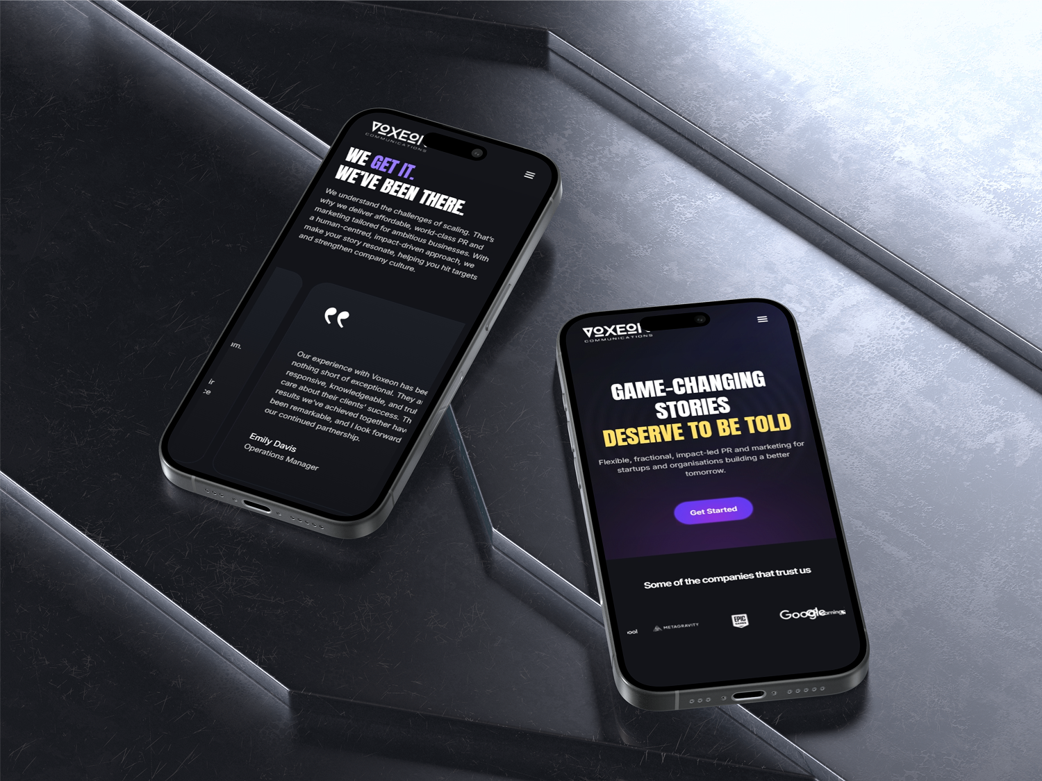
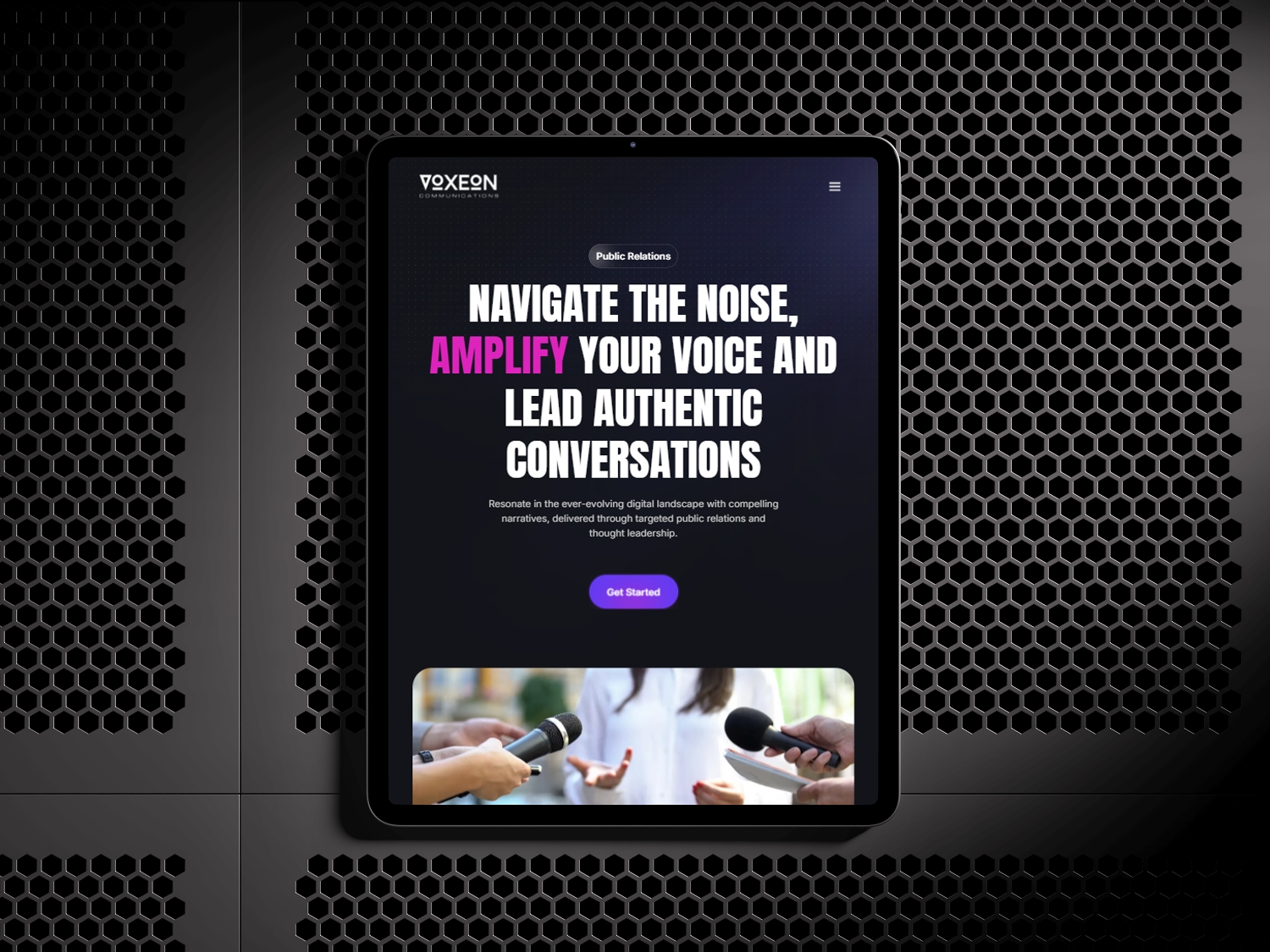
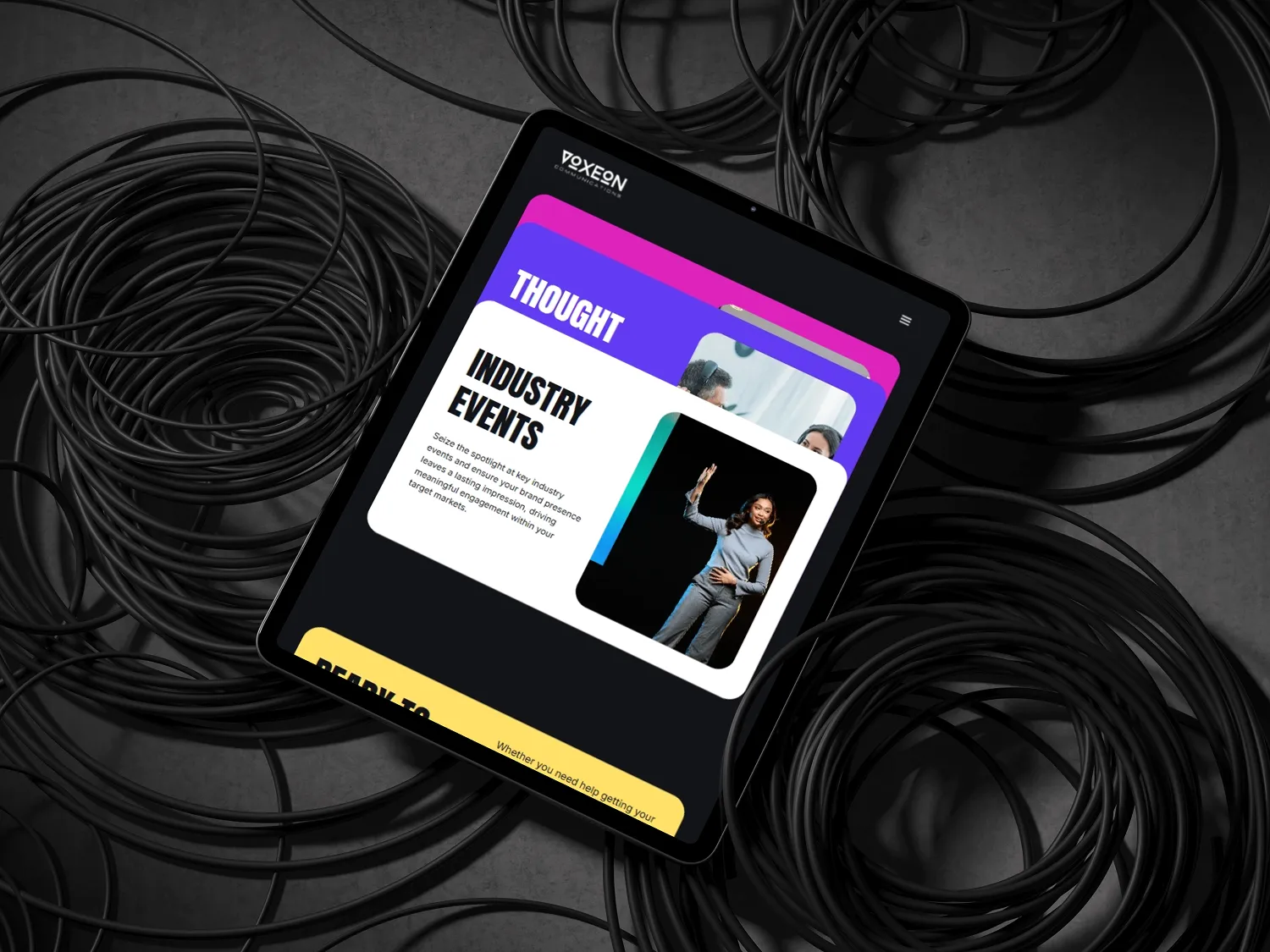
The problem was that none of that confidence made it onto the website. Voxeon had built a genuinely strong visual identity — a dark background palette, bold typography, a purple accent system — but the site that existed wasn't using any of it to its potential. The messaging was cautious. The layout was safe. The overall effect was a brand that clearly had a point of view but wasn't willing to express it.
That disconnect matters more for a PR agency than for almost any other kind of business. Voxeon's entire proposition is that they help clients communicate more powerfully. A website that doesn't demonstrate that capability is an active argument against hiring them.
What made Voxeon's brief different?
Most website briefs are about building something. Voxeon's brief was about unlocking something — taking an identity and a voice that already existed and giving them permission to be expressed at full volume.
The specific opportunity was Voxeon's fractional PR model: a positioning that distinguished them from traditional retained PR agencies by offering startup-appropriate pricing and scope without compromising on the calibre of thinking or execution. This was a genuine point of differentiation in the market, but it wasn't being communicated. Prospects were arriving at initial meetings without understanding the model, which meant every first conversation started with explanation rather than evaluation.
Project: Voxeon Communications — website design and Webflow development
Duration: 4 weeks
Deliverable: Full Webflow website with CMS for case studies and insights
Live: voxeon.global
Challenge

What specific problems was Voxeon's website creating for the business?
The consequences of an underperforming website for Voxeon were unusually direct and measurable. Because Voxeon works with startups and impact-driven organisations — companies where founders do a lot of research before making any decision — the website was the first substantive point of contact for the majority of prospects. If it failed to communicate what Voxeon does and why it's different, the damage happened before anyone picked up the phone.
Three specific problems were costing the business:
- The fractional model wasn't explained. Voxeon's approach — offering senior PR expertise on a fractional basis, at a price point that works for startups — is the most important thing a prospect needs to understand before deciding whether to get in touch. It wasn't on the site in any legible form. Prospects were arriving at meetings confused about what they were buying, which meant the first meeting was spent explaining rather than selling.
- The "good guys" positioning wasn't visible. Voxeon's focus on startups making positive change — their implicit filter for the kind of client they want to work with — gave them a differentiation that most agencies don't have. But the site read like a general PR agency. Startups working on impact-driven projects didn't see themselves reflected in it, which meant that the clients most likely to be an ideal fit weren't self-selecting in.
- Visual identity implementation was incomplete. The dark background, bold typography, and purple accent system had real potential. But the execution had inconsistencies — contrast ratios that made text difficult to read, accent colour used too frequently and losing its punch, typographic hierarchy that wasn't doing enough work to guide the reader through content. The identity existed but wasn't being implemented with the precision it deserved.
Why is a PR agency's website a higher-stakes design project than most?
Every service business's website is implicitly an argument for hiring them. But a PR agency's website is an unusually explicit one. If a PR agency's site doesn't communicate clearly and compellingly, it's not just a missed opportunity — it's active evidence that the agency can't do for itself what it promises to do for clients. Prospects notice this. The bar for a PR agency's own communications is higher than it is for a law firm or an accountancy practice, because communication is the product.
Approach
How do you implement a strong visual identity with the precision it deserves?
Designer Alex's starting point was the existing brand identity — the dark background palette, the bold typography, the purple accent — and a forensic audit of where the current implementation was falling short.
The contrast ratios were the first thing to fix. Voxeon's dark background approach has genuine dramatic potential, but it requires careful management of text legibility across different weights and sizes. Several sections of the existing site had contrast ratios that made body copy genuinely difficult to read — not dramatically so, but enough to create a low-level friction that accumulated over the course of reading a page. Every text element was tested and adjusted until legibility was clean throughout.
The purple accent system was the second major implementation repair. On the existing site, purple had been used too broadly — as a background colour, a border, a button colour, a highlight. Used that widely, an accent colour loses its function: it can no longer direct attention because it's everywhere. The new implementation reserved purple for a small number of specific functions — primary calls to action, key data points, and selected emphasis — and removed it from everything else. The effect was immediate: the moments where purple appeared became visually significant in a way they hadn't been before.
How was Voxeon's fractional PR model communicated on the site?
Making the fractional model legible required editorial work before design work. The concept needed a clear, plain-language explanation that didn't assume the visitor had encountered fractional services before — because most hadn't. We developed a simple framework: what fractional PR means, how it differs from a traditional retained agency, what it costs relative to alternatives, and who it's right for.
This content was given prominent placement — not buried in an About page, but accessible from the homepage within two interactions. The goal was that every prospect who spent five minutes on the site would arrive at a meeting already understanding Voxeon's model. That understanding changes the conversation.
How was the typographic hierarchy rebuilt to do more work?
Typography in a dark-background design carries more weight than in a light-background design because there's less supporting visual structure — the reader depends more on typographic cues to understand what matters and what's context. The existing hierarchy wasn't doing enough of that work: heading sizes were inconsistent, the distinction between primary and secondary text wasn't sharp enough, and the line spacing in body copy was creating a density that made sustained reading difficult.
The rebuilt hierarchy used size, weight, and spacing as a deliberate system — each level clearly distinguishable from the next, with body copy adjusted to a line spacing and measure that made it genuinely comfortable to read at length. The result was a site that didn't just look better: it was easier to actually read, which directly affects how much of the content prospects absorb.
Feedback

What changed for Voxeon after the site launched?
The clearest signal of success came from the pitch meetings. Voxeon's team reported that the nature of first conversations with prospects changed substantially after launch. Prospects who had visited the site came to meetings already understanding the fractional model — which meant the conversation could start with "does this fit what we need" rather than "let me explain what this is."
That shift has a compounding effect over time. Meetings that start further along close at a higher rate. Time spent explaining the model is time that could be spent building the relationship. A website that does the positioning work in advance doesn't just improve first impressions — it improves the efficiency of every conversation that follows.
Two other outcomes were significant:
- The startup-friendly positioning started self-selecting the right clients. Smaller companies who had previously assumed they couldn't afford PR found the site and got in touch. The explicit positioning for startups — the language, the case studies, the pricing clarity — gave them permission to consider Voxeon that the previous site hadn't offered.
- The team started sharing the site. Voxeon's own team members began actively sharing the site in their own networks — which is a meaningful signal. People share things they're proud of. A team that's proud of its own website becomes a distribution channel for the brand in a way that a team embarrassed by it never will.
What does a CMS-driven content strategy look like after a Webflow rebuild?
One of the lasting outcomes of the project was a CMS structure that made content production genuinely easier. Before the rebuild, Voxeon's blog production was monthly — the friction of updating the old site made publishing an event rather than a routine. After launch, with a Webflow CMS that made publishing straightforward, that cadence increased to weekly. Over time, that difference in publishing frequency compounds into a substantial difference in organic reach and authority.
FAQ
How do you translate a strong visual identity into a website that actually performs?
Strong visual identities often underperform on the web because web implementation introduces constraints and requirements that static brand design doesn't have to address — contrast ratios for legibility, responsive behaviour across screen sizes, typographic hierarchy that works in body copy as well as display type. The translation requires a forensic audit of where the identity as designed needs to be adjusted for screen, and the discipline to make those adjustments without compromising what makes the identity work. For Voxeon, that meant adjusting contrast ratios, resetting the accent colour system, and rebuilding the typographic hierarchy — all before any new pages were designed.
How should a PR or communications agency position itself on its own website?
A PR agency's website is the clearest possible demonstration of what the agency can do for clients. It should be specific about who the agency is for, clear about what makes its approach different, and written with the same editorial confidence the agency would bring to a client's communications. Agencies that hedge on their positioning — trying to appear relevant to every potential client — end up appearing relevant to none. The most effective agency websites make clear choices about audience and approach, accept that this will make them irrelevant to some prospects, and trust that it will make them the obvious choice for the right ones.
What is a fractional PR model and how do you explain it on a website?
Fractional PR means accessing senior PR expertise on a part-time or project basis rather than through a full retained engagement. It's a model designed for startups and growing companies that need strategic communications capability but aren't at the stage where a full retained agency fee makes sense. Explaining it on a website requires a plain-language description of what fractional means, a comparison to the alternatives (retained agency vs. in-house hire vs. fractional), and clear guidance on who it's right for. Prospects who have never encountered fractional services before need that context before they can evaluate whether it fits their situation.
How important is dark-background design for a PR or media agency?
Dark-background design can be highly effective for creative and communications agencies because it signals boldness and confidence — qualities that clients are looking for in an agency they'll trust with their brand. The risk is that dark backgrounds require more careful implementation than light ones: contrast ratios need to be carefully managed for legibility, accent colours need to be used sparingly to retain their punch, and typographic hierarchy needs to do more work to create structure. When implemented well, dark-background design is distinctive and memorable. When implemented carelessly, it's difficult to read and exhausting to spend time on.
How do you use website design to change the quality of sales conversations?
The website's job is to make the first sales conversation start further along. If prospects arrive at a meeting without understanding what the business does, who it's for, and what makes it different, the meeting is spent on explanation. If the website has done that work in advance, the meeting can start with evaluation and relationship-building. For Voxeon, making the fractional model legible on the site — accessible within two interactions from the homepage — was the single change most directly responsible for improving meeting quality. The design supports that communication. It doesn't substitute for it.

