Introduction

What made Protego Ventures different from every other financial website brief?
When CAPRI — the brand agency behind Protego's visual identity — approached BrandingLab
to translate their work into a Webflow website, the first thing we did was Google the name.
Protego is the shield charm from Harry Potter. For a venture capital firm investing in
defense technology companies, it was perfect. The name alone told us everything we needed
to know about the brand.
Protego Ventures backs founders building the next generation of defense technology —
a sector where credibility is non-negotiable, discretion is expected, and authority needs
to be communicated without a single wasted word. This wasn't a startup looking to look
impressive. This was a firm that needed to look like the smartest people in the room
before a defense technology founder even picked up the phone.
CAPRI had already done the hard work of defining the visual identity. Our challenge
was different: take a brand system that existed in static design files and make it live,
performant, and credible on the web — in four weeks.
What does a defense technology VC website actually need to do?
Protego operates at the intersection of two worlds that rarely meet: the precise,
institutional language of venture capital and the serious, understated world of defense
technology. Their website needed to speak fluently to both defense technology founders
seeking investment and to institutional investors evaluating the fund.
For founders, the site needed to communicate: these people understand our world.
For LPs, it needed to communicate: these people are serious operators. Both
audiences are sophisticated. Neither would tolerate anything that felt generic, flashy,
or template-built.
Project: Protego Ventures website — design translation and Webflow development
Client: Protego Ventures (via CAPRI brand agency)
Duration: 4 weeks
Deliverable: Full Webflow website with SEO foundation
Live: protego.vc
Challenge

What makes a defense technology VC website uniquely difficult to build?
Most VC websites fail in one of two directions. They either go too clinical — grey text on white, portfolio logos in a grid, a generic "we back founders" headline — or they overcorrect into aggressive visual design that signals creative agency rather than financial authority. Protego couldn't afford either mistake.
The specific challenges we were working against:
- Translating, not reinventing. CAPRI had designed the visual identity. Our role was translation, not interpretation. Every design decision needed to honour their system while making it functional on the web — a constraint that requires more discipline than building from scratch.
- The photography problem. Defense technology is visually difficult. Stock photography in this space falls into two traps: sterile corporate imagery that communicates nothing, or military-adjacent imagery that makes a VC look like a recruitment agency. We needed images that conveyed seriousness about advanced technology without either extreme.
- Authority through restraint. In defense tech, the instinct to impress with animation and visual complexity is exactly wrong. Founders and LPs in this space are pattern-matching for the kind of judgment that shows up in subtlety. Every element we considered adding, we had to first ask: does this communicate precision, or does it communicate noise?
- Navigation as a trust signal. In most website projects, navigation is functional. For Protego, it was a direct expression of how the firm thinks. Cluttered navigation says cluttered thinking. The structure of how information is organised would be read — consciously or not — as a proxy for how Protego organises their investment thesis.
Why do VC firms struggle to communicate authority online?
The core tension in investment firm web design is between wanting to appear established and wanting to appear active. Firms that over-index on gravitas look static. Firms that over-index on activity look like they're chasing deals. The best VC websites project a specific kind of quiet confidence — the visual equivalent of someone who doesn't need to raise their voice to be heard. Getting there requires unusually careful editorial judgment at every step of the design process.
Approach
How do you translate a visual identity into a website without losing what makes it work?
The starting point was three weeks of colour exploration — which might sound excessive for a single design decision, but for Protego, getting the colour right was the entire project.
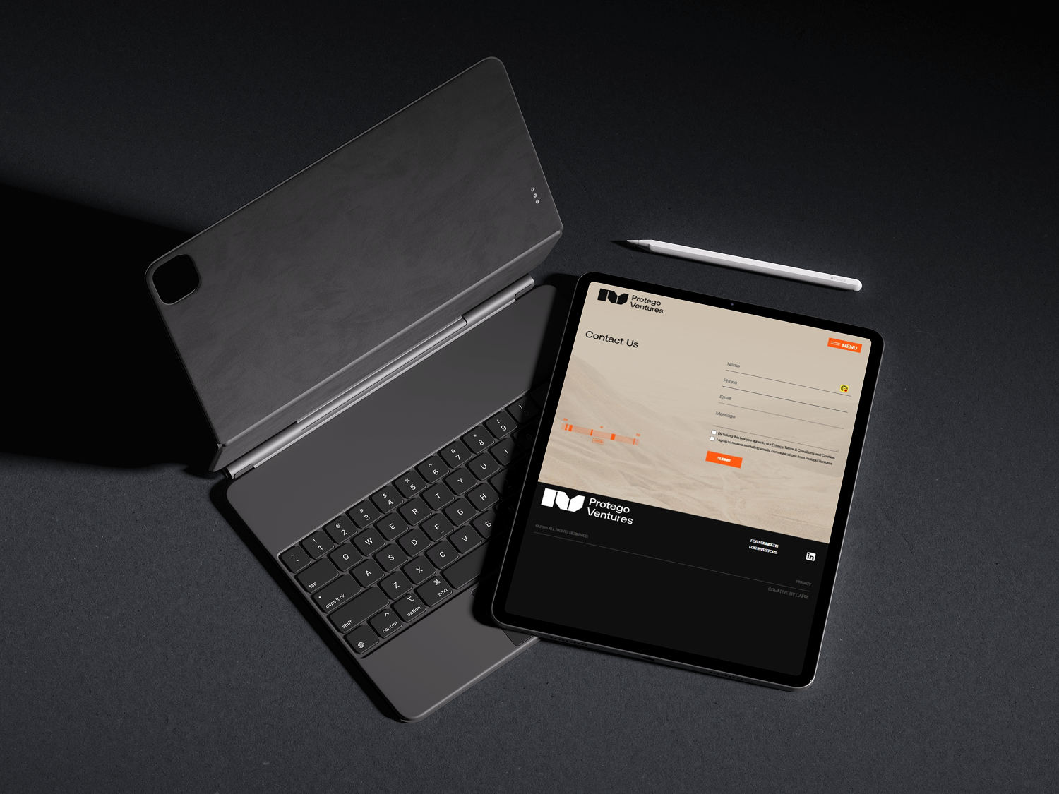
CAPRI's system centred on a particular shade of beige. Not the warm, friendly beige of a consultancy trying to appear approachable. This was a precise, restrained beige — closer to the neutral tones used in certain military and industrial environments. That wasn't coincidental on CAPRI's part, and it couldn't be accidental on ours. On screen, beige is notoriously difficult. It can read as dated, unintentional, or simply beige. We went through dozens of hex value iterations across different screen calibrations and ambient lighting conditions before landing on the exact value that held the weight CAPRI had designed into it.
The orange accents required equal care. They had to pop — providing visual relief against the restrained base palette — without tipping into energy or enthusiasm that the brand explicitly didn't want.
How did the photography approach solve the defense technology imagery problem?
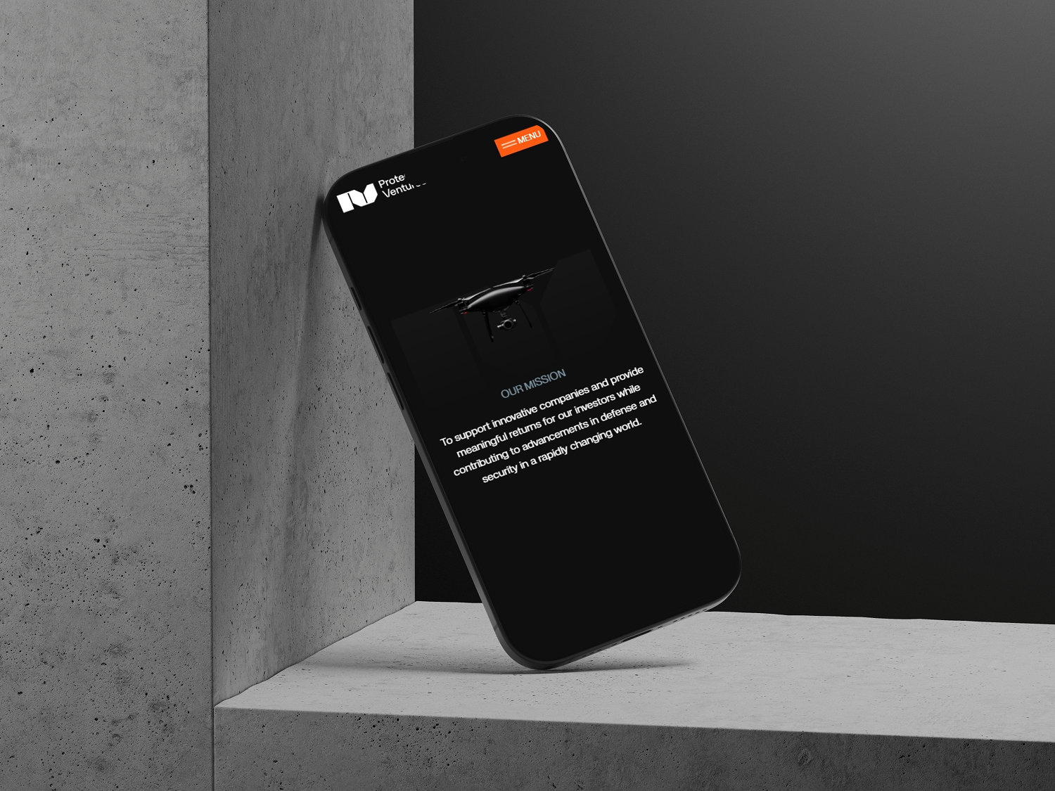
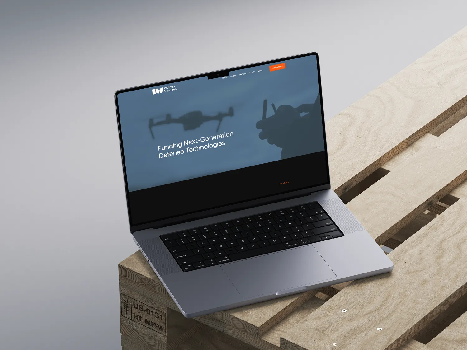
We built a photography brief around one rule: monochromatic images of defense technology hardware and research environments. No people in combat gear. No flags. No stock photo handshakes. The images needed to convey the seriousness and precision of the technology sector Protego invests in — advanced engineering, autonomous systems, dual-use technology — while maintaining the compositional language of the brand.
Our designer David described the brief as "hunting for unicorns." The images exist, but finding the specific intersection of technically credible, compositionally strong, and tonally aligned with a restrained luxury palette required systematic curation across multiple image libraries. We assembled a shortlist of forty and narrowed to twelve that earned their place on the site.
What was the navigation philosophy for a firm where information architecture is a trust signal?
The navigation went through seven iterations — not because we couldn't decide, but because each version revealed something about the hierarchy of Protego's message that the previous version hadn't resolved.
The final architecture separated the firm's investment thesis from its portfolio and its team — three distinct mental models for three distinct visitor types. A founder evaluating whether Protego understands their sector goes to the thesis. An LP evaluating track record goes to the portfolio. Anyone doing due diligence on the partners goes to the team page. Each path is unambiguous and requires no guesswork.
"Like a well-designed weapon," David said when we locked the final navigation structure — "everything unnecessary has been removed." That became the informal brief for the rest of the build.
What does the Webflow build look like for a high-stakes brand translation project?
With the design locked, the Webflow build was a precision exercise. CAPRI's design system included specific spacing ratios, typographic hierarchy decisions, and component-level detail that all needed to survive the translation from static Figma files to a live, responsive, performant web environment.
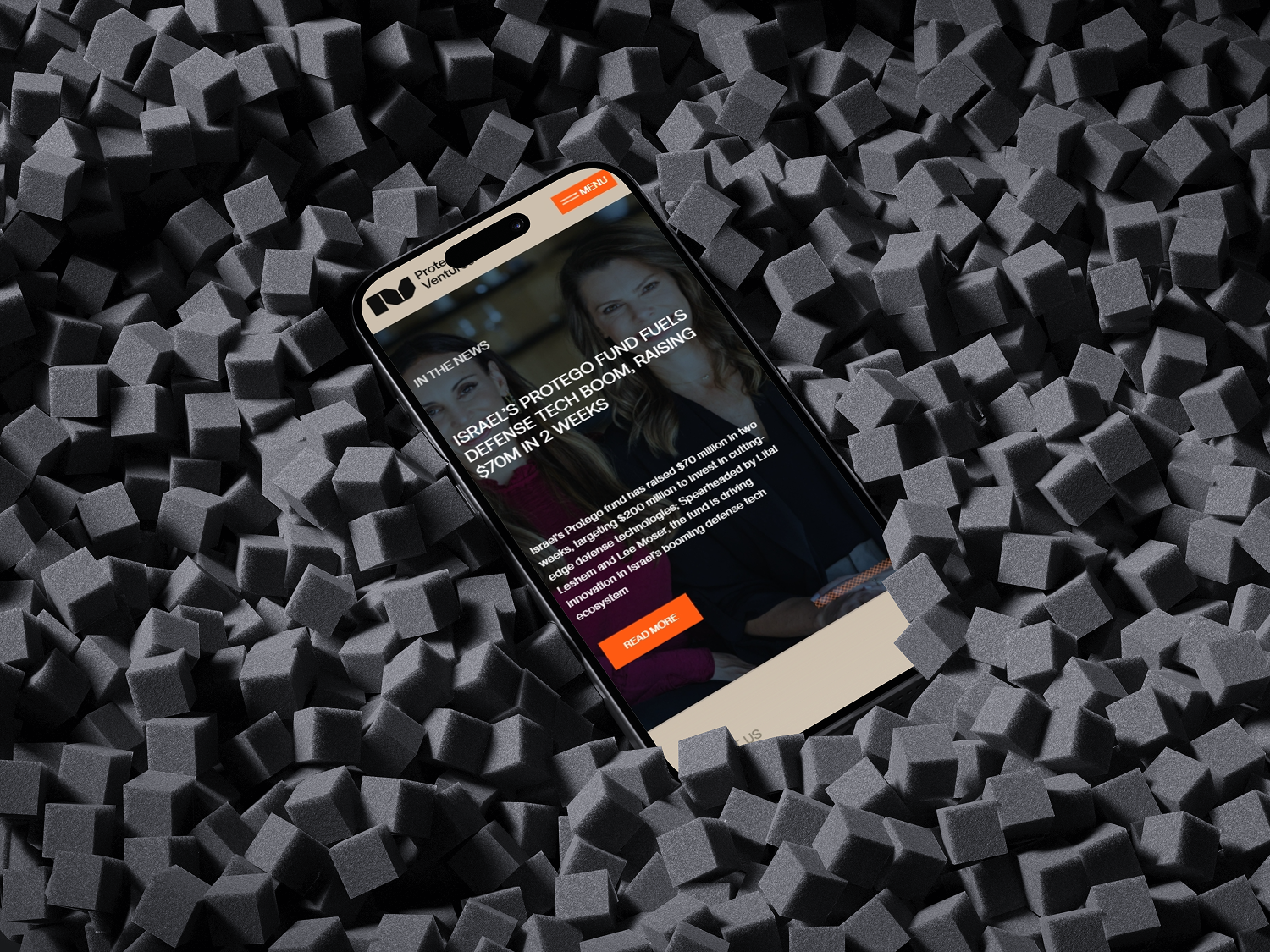
We built the site on a utility-first class architecture — meaning that future content updates by Protego's team would maintain the visual system without requiring a designer to intervene. The CMS structure was kept intentionally minimal: a portfolio collection for investments, a team collection for partners, and a simple news section for announcements. No complexity the Protego team couldn't manage independently.
SEO foundations were built into the site from day one: structured heading hierarchy, meta descriptions written for each page, image optimisation, and clean URL structure. For a firm where appearing in the right searches matters more than traffic volume, precision SEO matters more than scale.
Feedback

What did Protego Ventures say about working with BrandingLab?
"Working with BrandingLab was like finding a partner who could read our minds. They understood that in our world, subtlety and precision matter more than flash. The website they created communicates authority and expertise in exactly the way we need to approach defense technology founders and investors. It's become a crucial tool in establishing our credibility in a highly competitive space."
— Protego Ventures
What changed for Protego after the website launched?
The most telling feedback was what Protego didn't have to explain anymore. Before the site, introductory conversations with founders and LPs often began with context-setting — explaining the firm's focus, its thesis, its position in the defense technology ecosystem. After launch, that groundwork arrived before the conversation started.
Prospects who had visited the site came to meetings already understanding what Protego does, who they back, and why the firm's approach is differentiated. The website was doing the positioning work that had previously required significant time in every early-stage conversation.
For a four-week project, that's the highest possible return: a site that makes every subsequent business development conversation shorter, sharper, and more likely to close.
What does this project demonstrate about BrandingLab's approach?
Protego Ventures is the kind of project that tests whether an agency can subordinate its own creative instincts to serve a client's existing brand system. The temptation in design is always to add — more visual interest, more animation, more personality. This project required the opposite discipline: to hold the line, honour what CAPRI had built, and trust that precision and restraint would communicate more powerfully than creativity for its own sake.
That discipline is what we bring to every project where the brand already has authority and the website's job is to honour it.
FAQ
How long does it take to build a VC or investment firm website?
A focused VC or investment firm website typically takes three to six weeks. The Protego Ventures site completed in four weeks because CAPRI had already developed the visual identity system — meaning BrandingLab's scope was translation and Webflow development rather than brand creation. Projects that require both brand strategy and web development run six to twelve weeks depending on complexity.
What should a venture capital website communicate to founders?
A VC website needs to answer three questions in the first thirty seconds: what sectors do you invest in, what stage, and why should a founder choose your firm over the next one. Beyond that, the design and tone need to signal judgment — founders are assessing whether your firm understands their world. Generic financial website templates signal that you don't.
How do you design a website for a niche like defense technology?
Niche expertise websites succeed through specificity, not generality. For Protego, that meant sourcing photography specific to defense technology hardware and research environments, building a colour palette with deliberate resonance in military and industrial contexts, and structuring navigation around the mental models of defense technology founders and institutional investors — not generic website visitors. Generic websites communicate generic thinking. Niche expertise needs to look like niche expertise.
Can BrandingLab build a website from a brand identity created by another agency?
Yes — this is a common and often underrated project type. When a brand agency has designed a strong visual identity system, translating it faithfully into a live, performant, responsive website requires a specific discipline: understanding the design intent deeply enough to make the hundreds of small decisions that aren't specified in a brand guide. BrandingLab's Figma-to-Webflow process is built specifically for this kind of translation work.
How does SEO work for a VC firm that doesn't need high traffic volumes?
Most VC firms don't need mass traffic — they need to appear when the right people search for them. That means precise keyword targeting (firm name, sector, investment thesis language), clean technical foundations (site structure, meta data, page speed), and enough content to establish topical authority in their investment focus area. The Protego project included SEO foundations built into the site architecture from day one, not retrofitted as an afterthought.
What's the difference between a website that looks premium and one that communicates authority?
Premium is visual — expensive photography, generous whitespace, refined typography. Authority is editorial — the clarity of how you explain what you do, the confidence of what you choose not to say, the structure of how information is organised. The Protego website needed both, but authority was the priority. A defense technology VC that looks beautiful but communicates vaguely loses the deal. One that communicates with precision and restraint wins it, even if it's less visually impressive than competitors.

