Targo Logistics
Brand strategy, identity and website for a bulk-freight network in Southern Africa
The problem
What I did
How it came together
The brief
Targo coordinates bulk freight across South Africa and six neighbouring countries. It doesn’t own trucks. It matches cargo owners with a network of owner-drivers and runs the back-office for both. The company had the track record and a BEE Level 2 rating, but no brand system, so every touchpoint looked different and older material described it as a fleet operator.
What I did
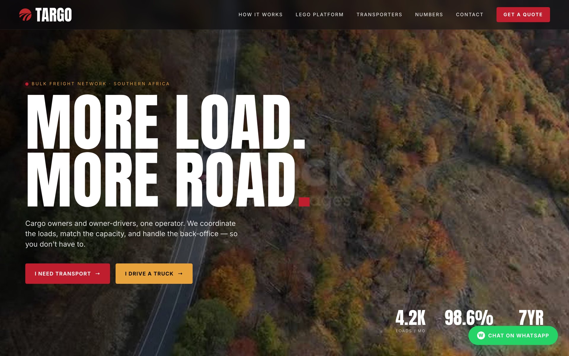
I started with strategy and messaging, and wrote the line “More Load. More Road.” It sets the voice: short, two-beat statements that end in a full stop.
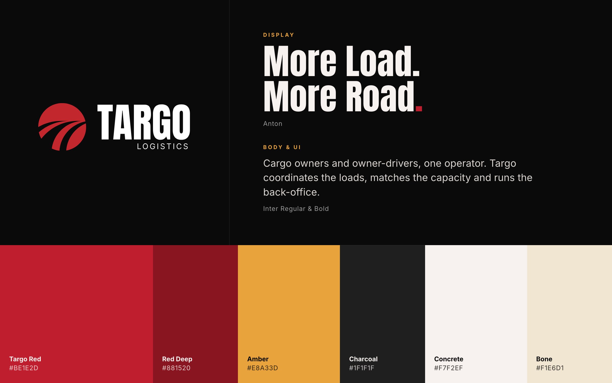
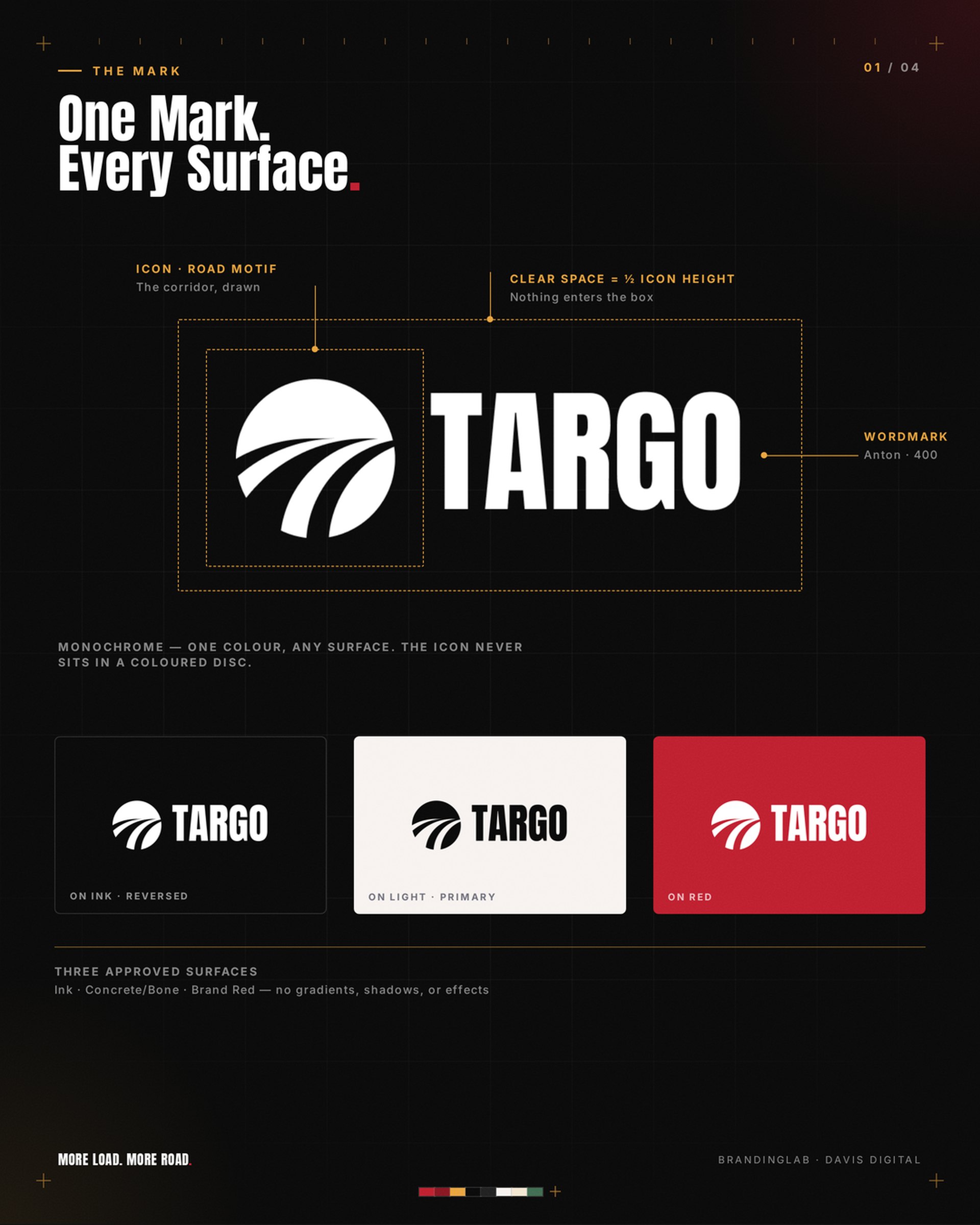
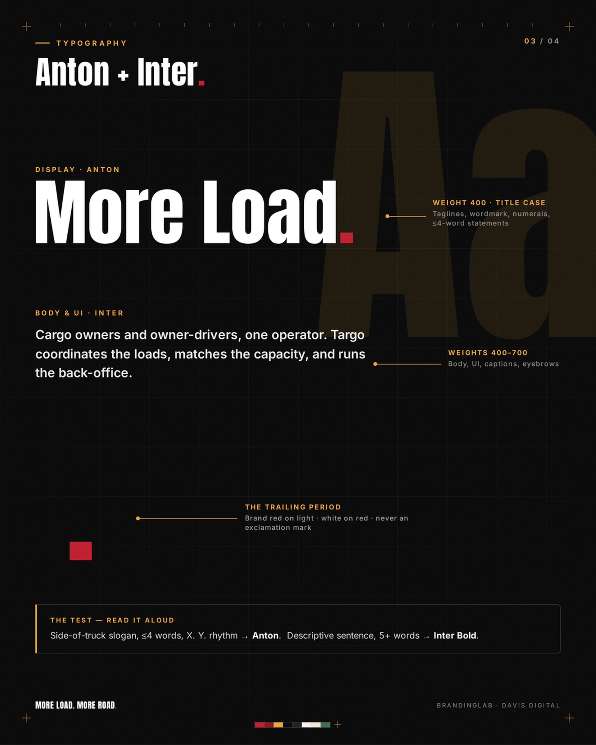
The identity is a red mark of road lines sweeping through a circle, with a wordmark, a badge and horizontal lockups. Anton carries the headlines and Inter does everything else. Red is kept for the logo, calls to action and the full stop at the end of a headline.
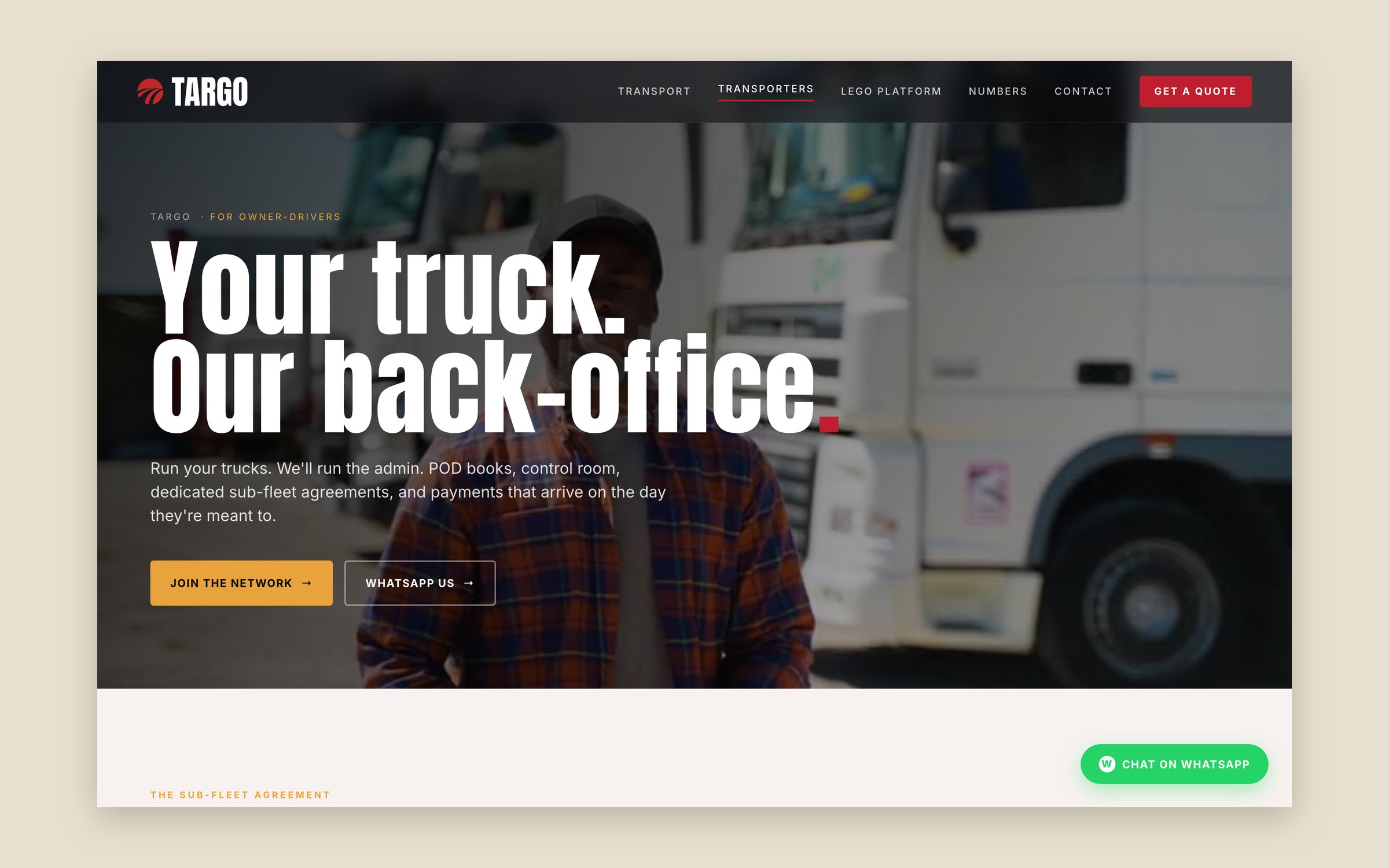
I documented it all as a brand system: tokens, type, components, imagery rules and a voice guide. One rule matters more than most. There are no stock or AI-generated truck photos, because they imply a fleet Targo doesn’t have.
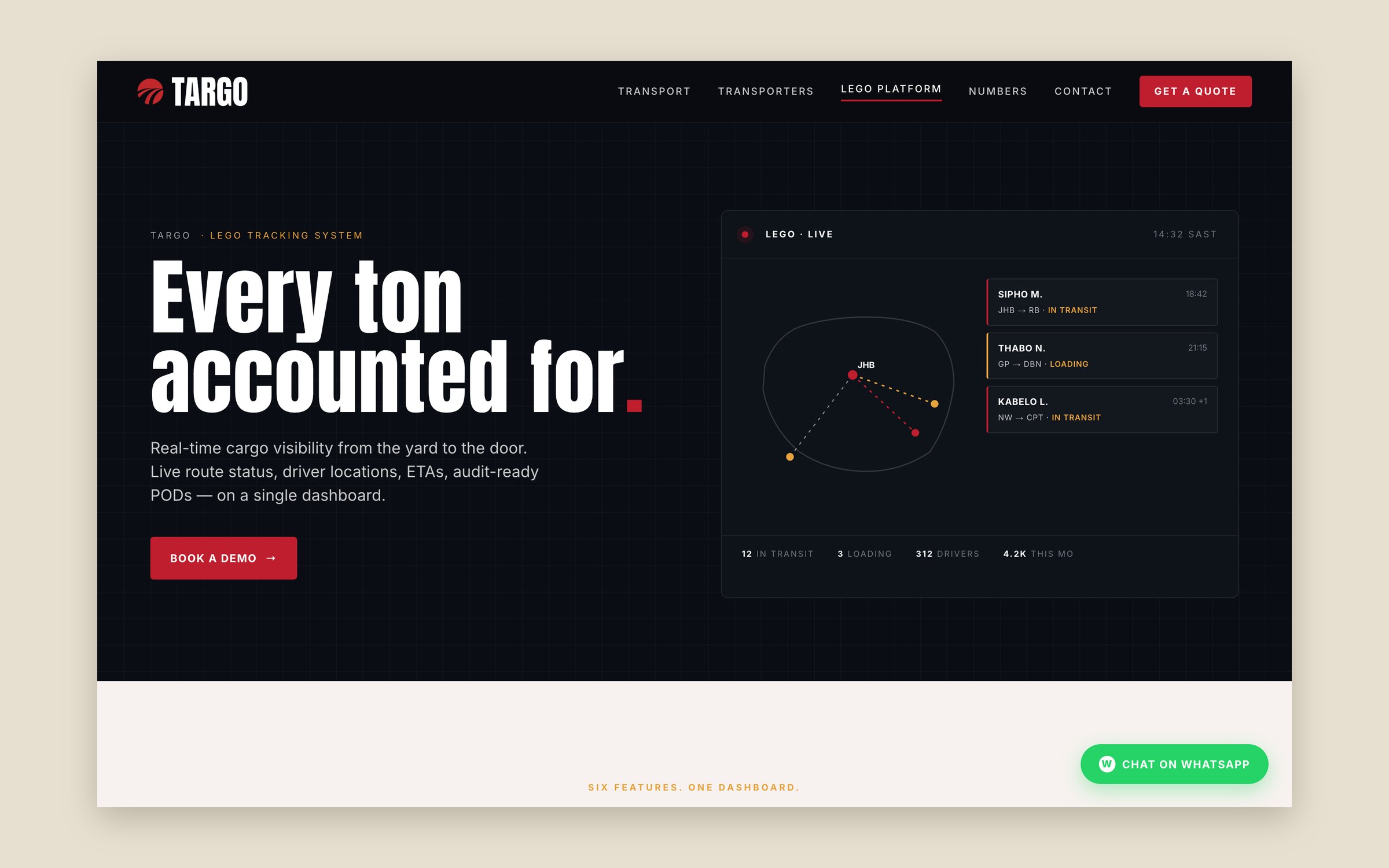
The website follows the same split as the business. Every page has two journeys, one for cargo owners and one for owner-drivers.
The outcome
Targo now presents itself as what it is: a network and a back-office, not a carrier. The same system runs across the website, social posts, business cards and recruitment ads.
The mark
The brand at work
On paper
The website
Planning something similar?
Book a 30-minute discovery call, or run the free AI test to see how answer engines read your site today.