Tabono
Naming, logo direction and a 20-page Webflow website, delivered in four weeks for a conference launch
The problem
What I did
How it came together
The brief
Tabono is a mining, industrial and logistics company working across African markets. It needed a name, a visual direction and a full website, and the website had to be live for a conference launch four weeks away.
What I did
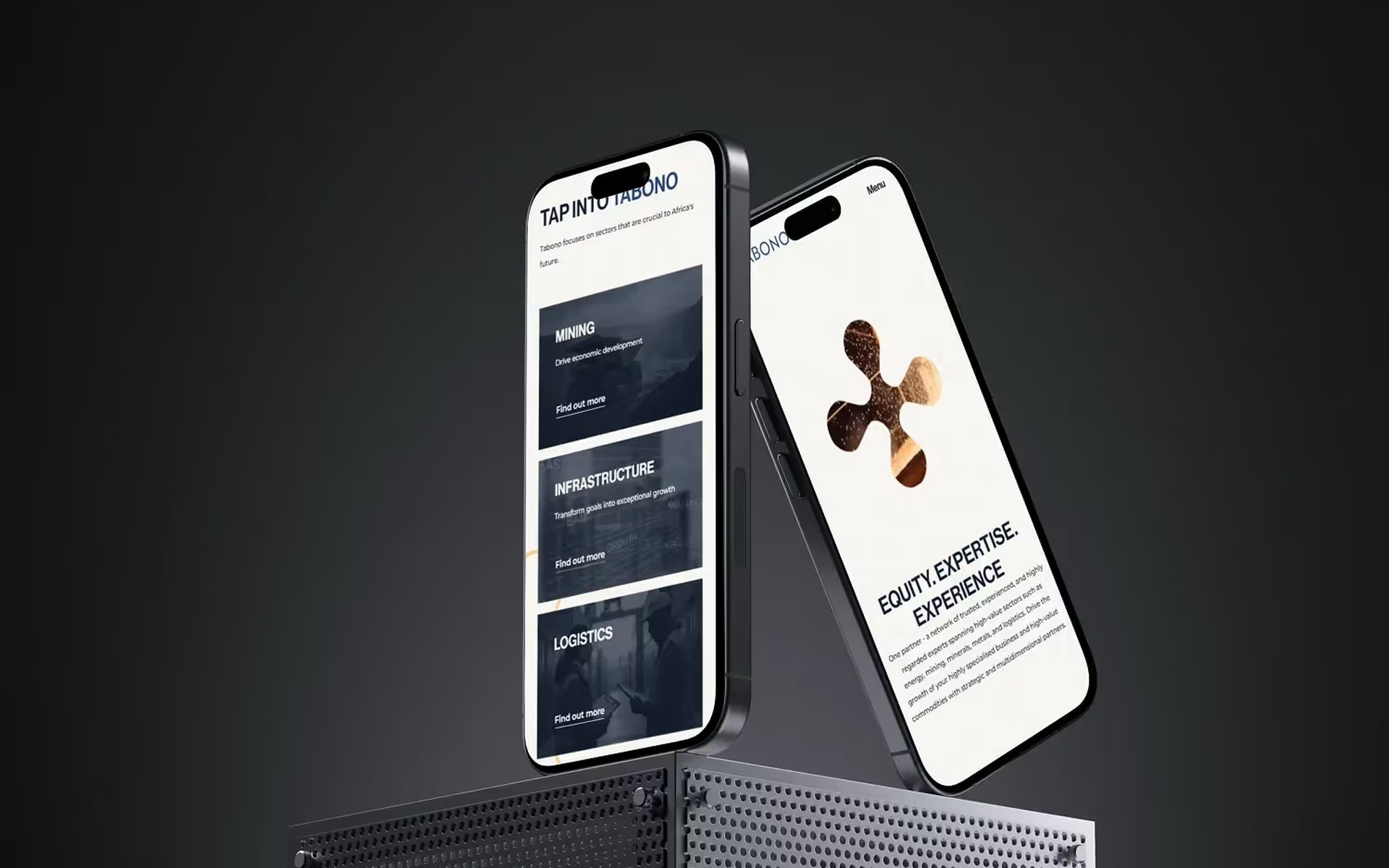
I named the company after Tabono, the Adinkra symbol for an oar, which stands for unity of purpose, strength and hard work. The symbol became the mark, set in orange on deep navy. Brand Smiths produced the final logo artwork.
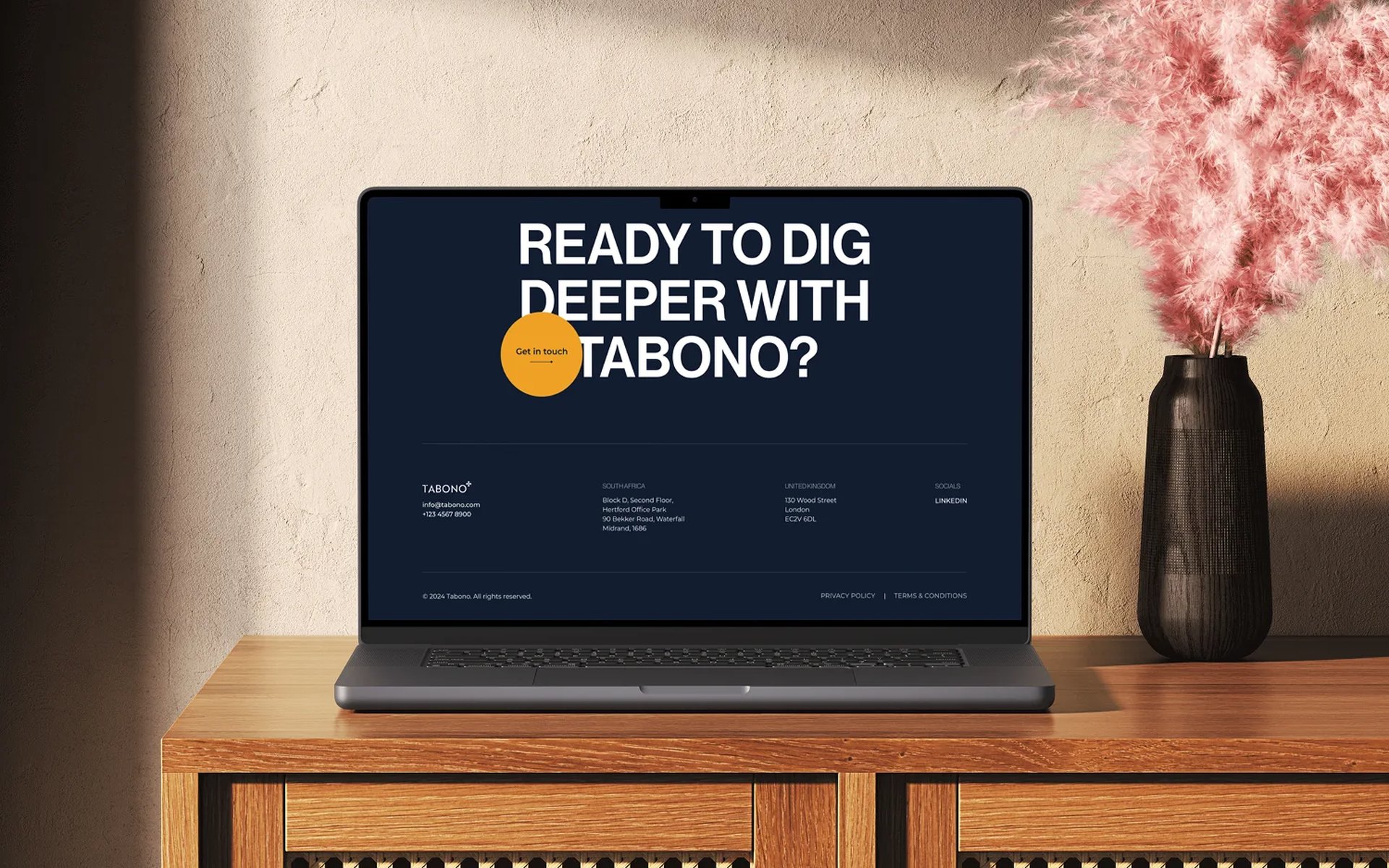
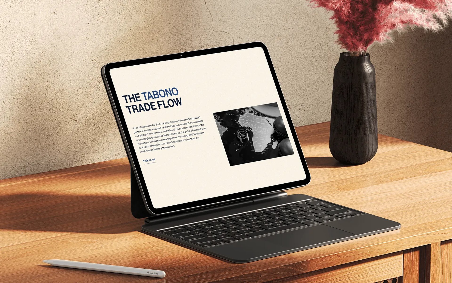
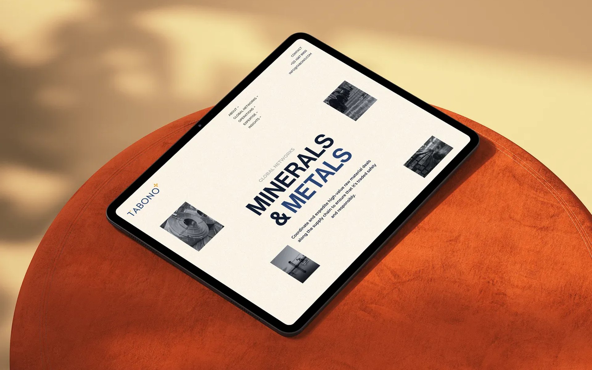
To meet the date, design and build ran side by side. Pelumi and I worked in Figma sprints while the Webflow build moved forward with them. The visual system draws on African design principles, such as geometric precision, strong structure and earthy tones, without leaning on decorative motifs.
The animation is hardware-accelerated and was tested across devices, so the site would hold up on exhibition-hall WiFi.
The outcome
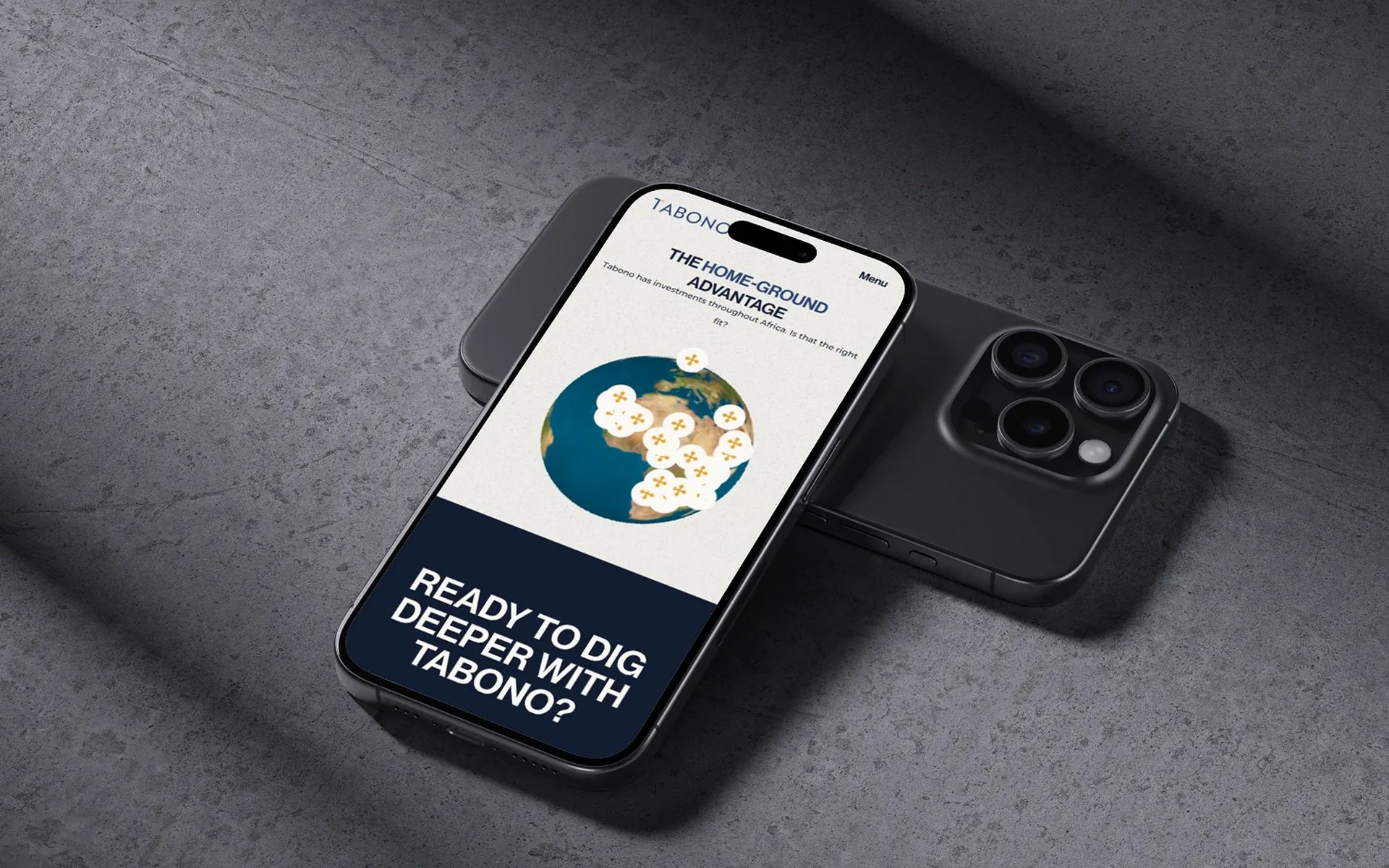
More than 20 pages went live in time for the conference. The full story, from the name to the website, is in the Tabono article.
The mark
The brand at work
On paper
The website
Questions about this project
What did BrandingLab do for Tabono?
BrandingLab named Tabono, set its logo direction and designed and built a website of more than 20 pages in Webflow, delivered in four weeks for a conference launch. Brand Smiths produced the final logo artwork.
What does the name Tabono mean?
Tabono is the Adinkra symbol for an oar. It stands for unity of purpose, strength and hard work, and the symbol became the company’s mark, set in orange on deep navy.
How was the Tabono website delivered in four weeks?
Design and build ran side by side: Figma sprints moved forward with the Webflow build. The animation is hardware-accelerated and was tested across devices, so the site would hold up on exhibition-hall WiFi.
Planning something similar?
Book a 30-minute discovery call, or run the free AI test to see how answer engines read your site today.