Sekta
Naming, brand identity and website for an industrial services group in South Africa
The problem
What I did
How it came together
The brief
TMS Industrial Services and Redec, two established South African industrial firms, were joining forces. The new group needed a name, an identity and a way to present itself as one bigger, more capable business, without erasing the two companies its clients already trusted.
What I did
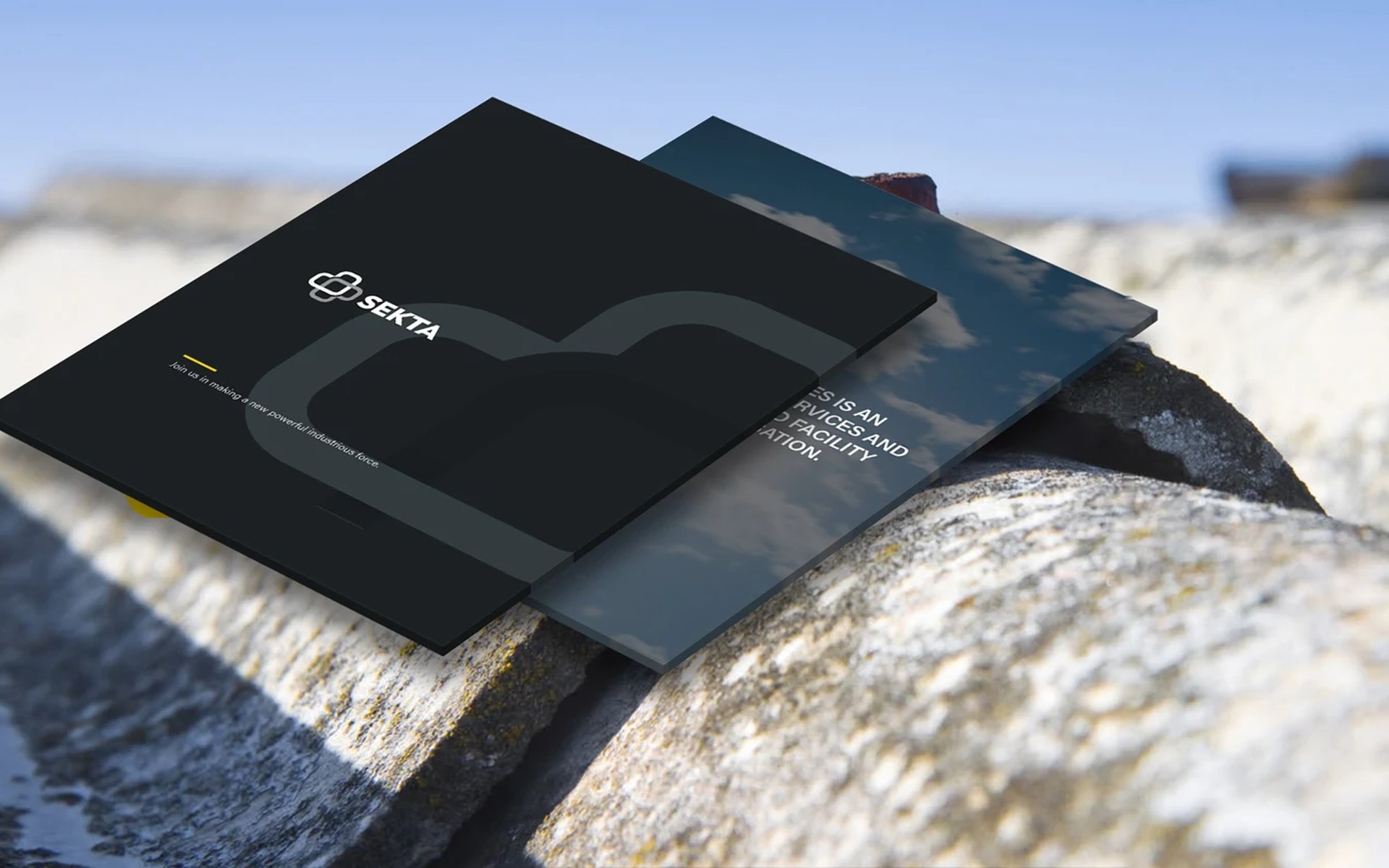
I started with the name. Sekta is the Swahili word for industry: short, easy to say and rooted in the continent the group works on.
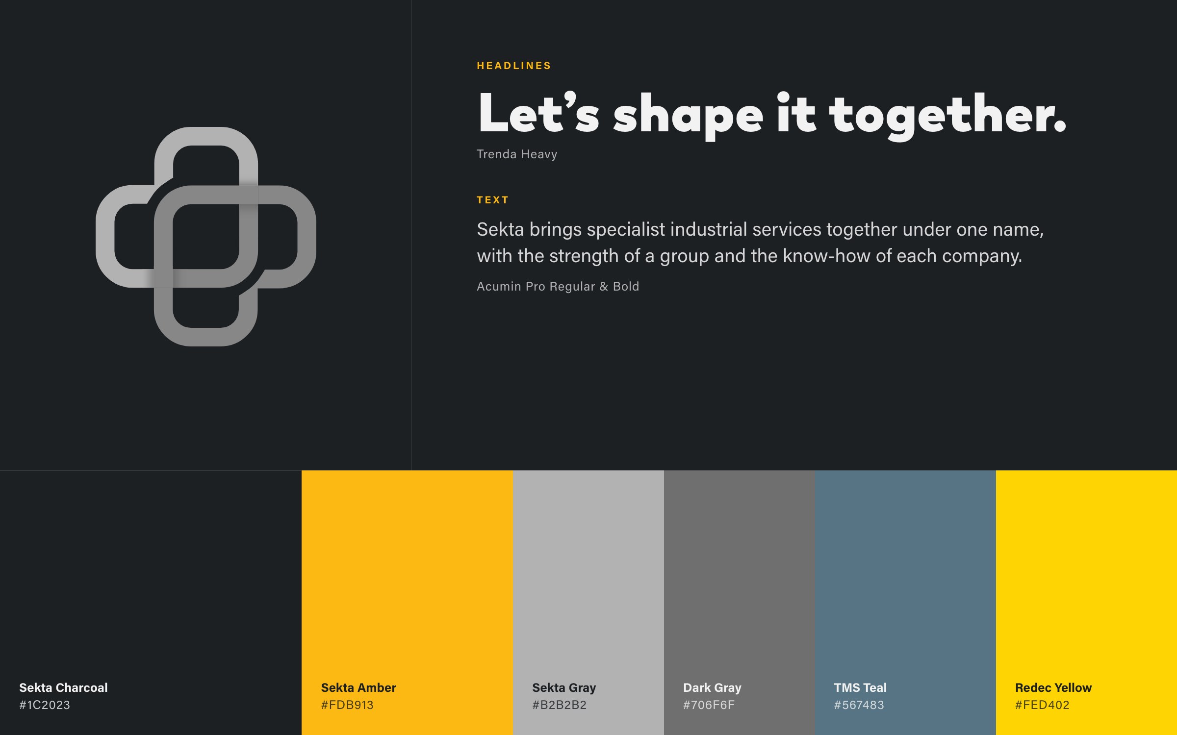
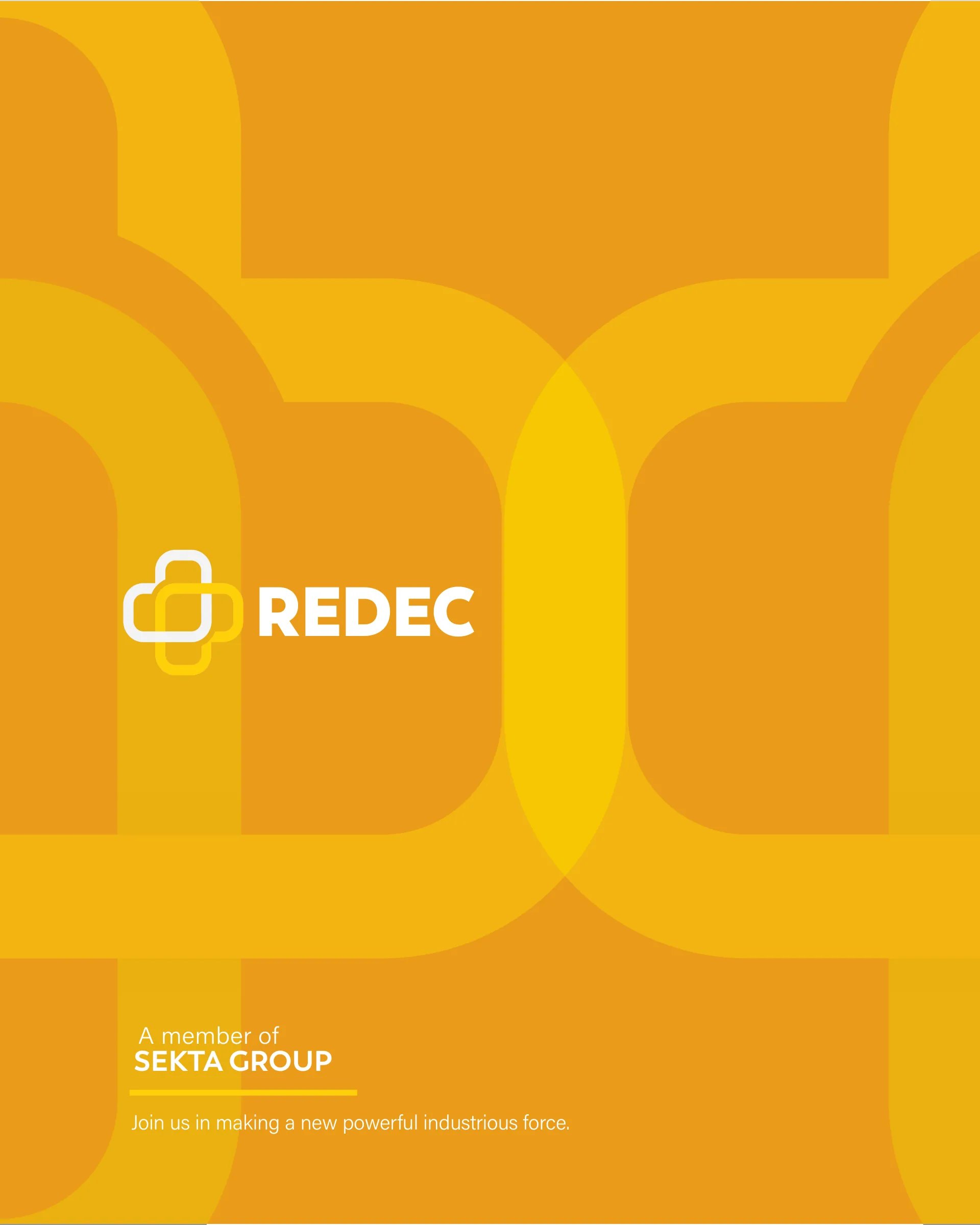
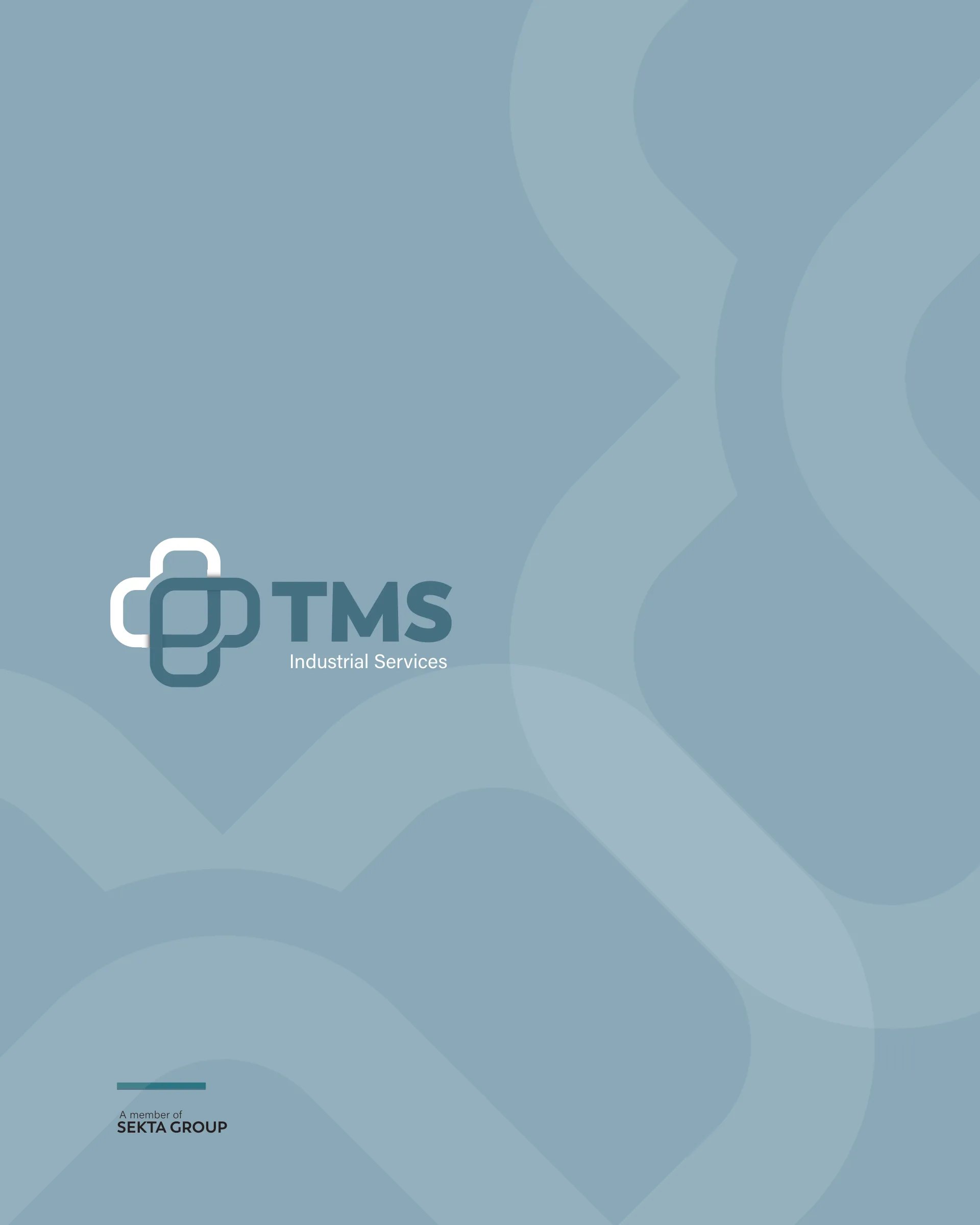
The mark is an interlocking cross of rounded links. The group uses it in grey, and each member company carries the same shape in its own colour: teal for TMS, yellow for Redec. It reads as one family at a glance, with room for more companies to join.
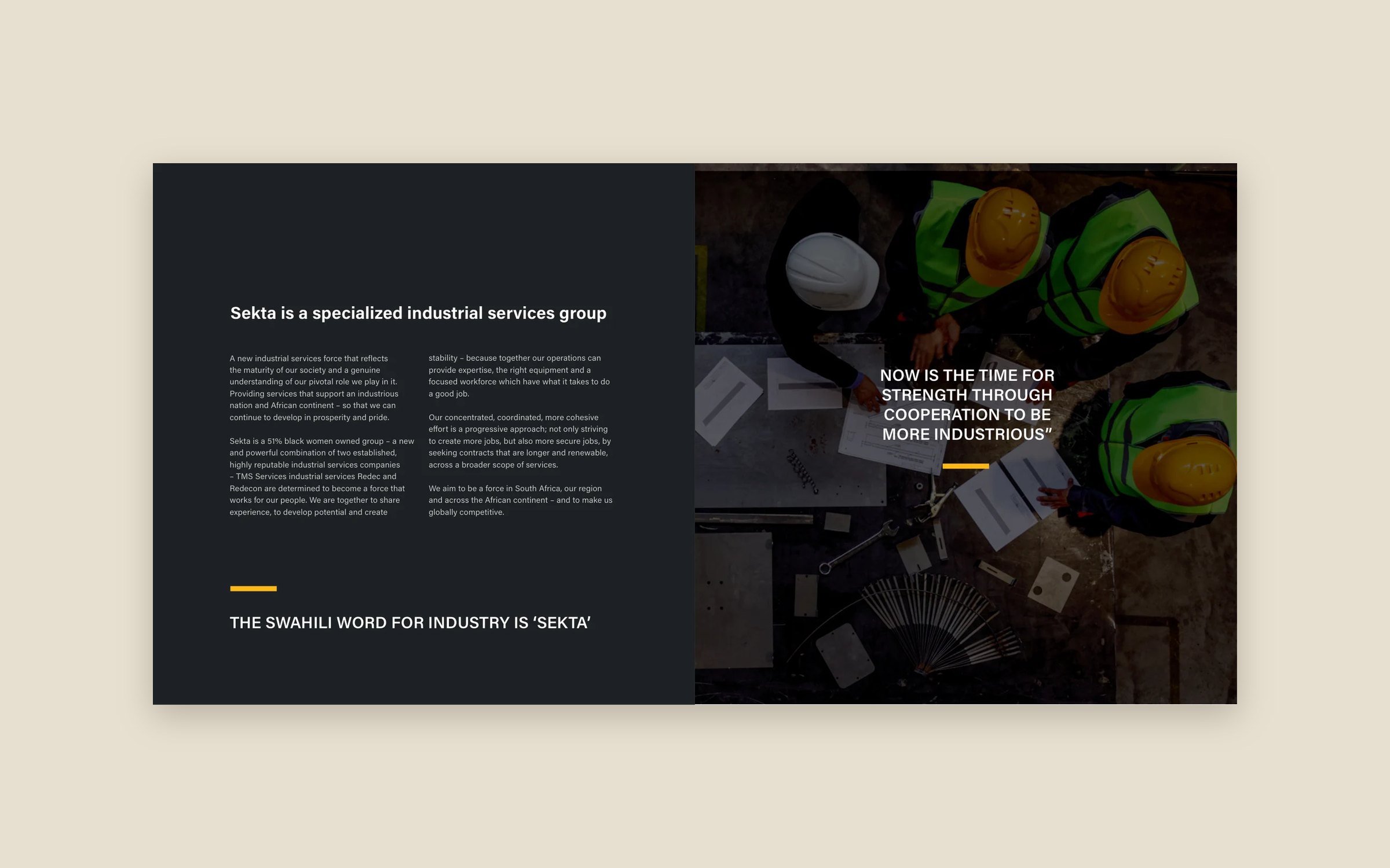
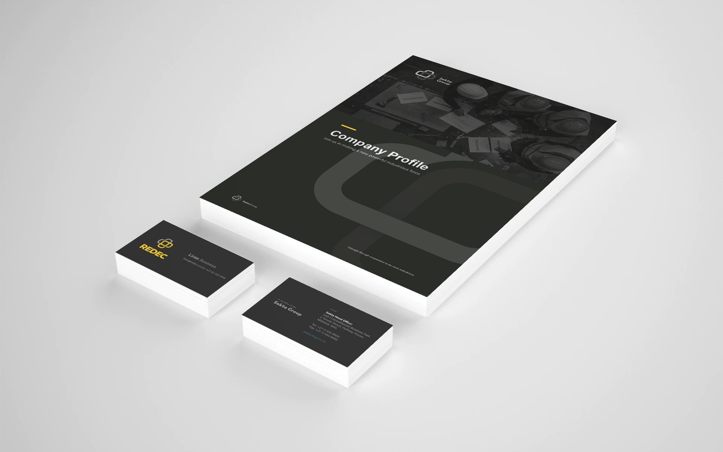
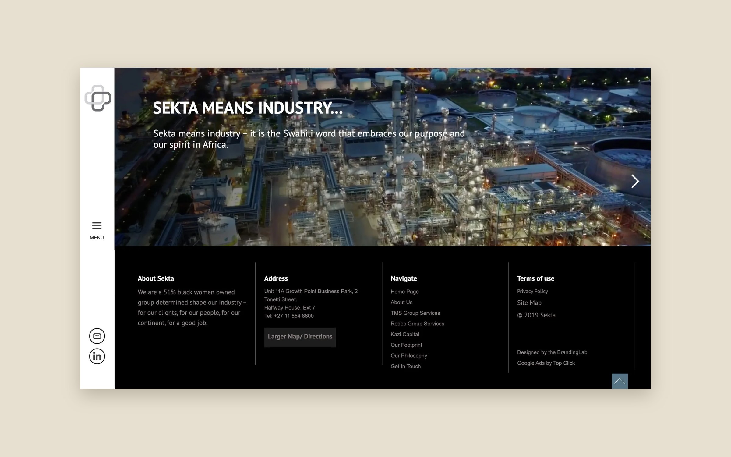
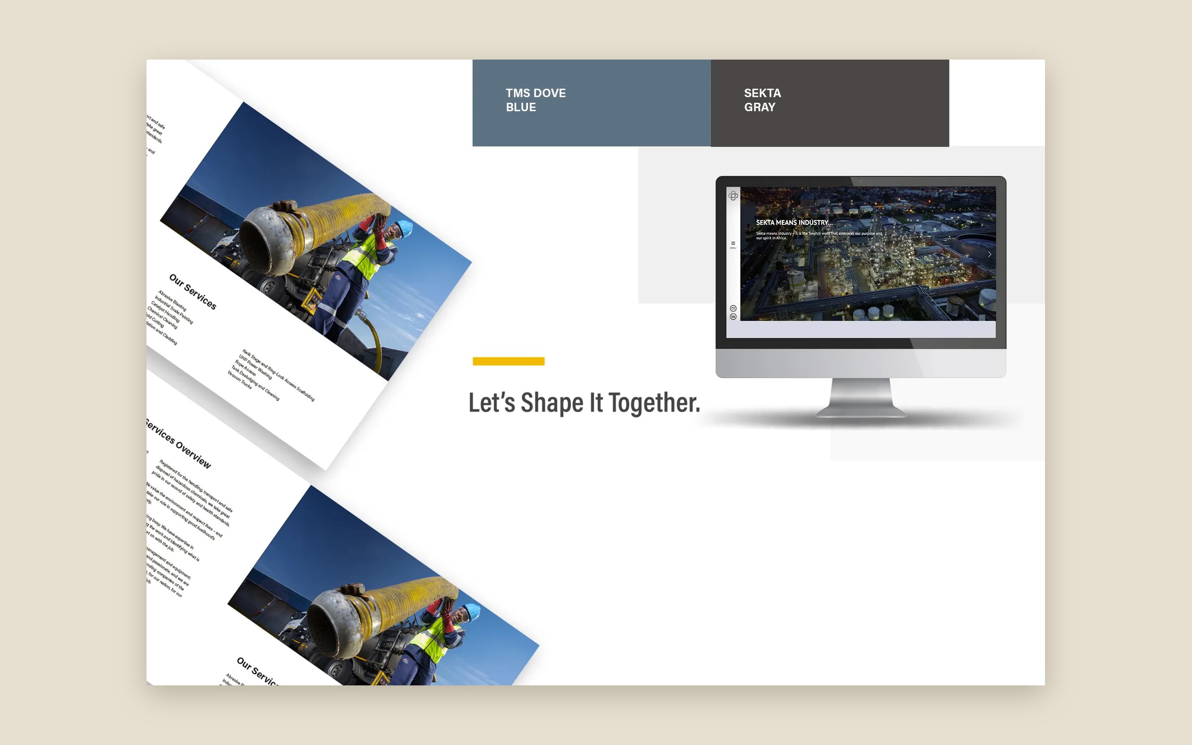
Around it I built the brand system: charcoal and amber for the group, Trenda for headlines, Acumin Pro for text, and the line “Let’s shape it together.” I then applied it to a group brochure, corporate profiles for TMS and Redec, a launch mailer and the group website.
The outcome
Sekta launched in 2020 with one name, one family of marks and a consistent look across print and the website. Each member company kept its own colour, so clients can still see the specialist behind each service.
The mark
The brand at work
On paper
In the feed
The website
Planning something similar?
Book a 30-minute discovery call, or run the free AI test to see how answer engines read your site today.