Opsi, Tramm & ORBIT
One family design system for a logistics technology company and its two product brands
The problem
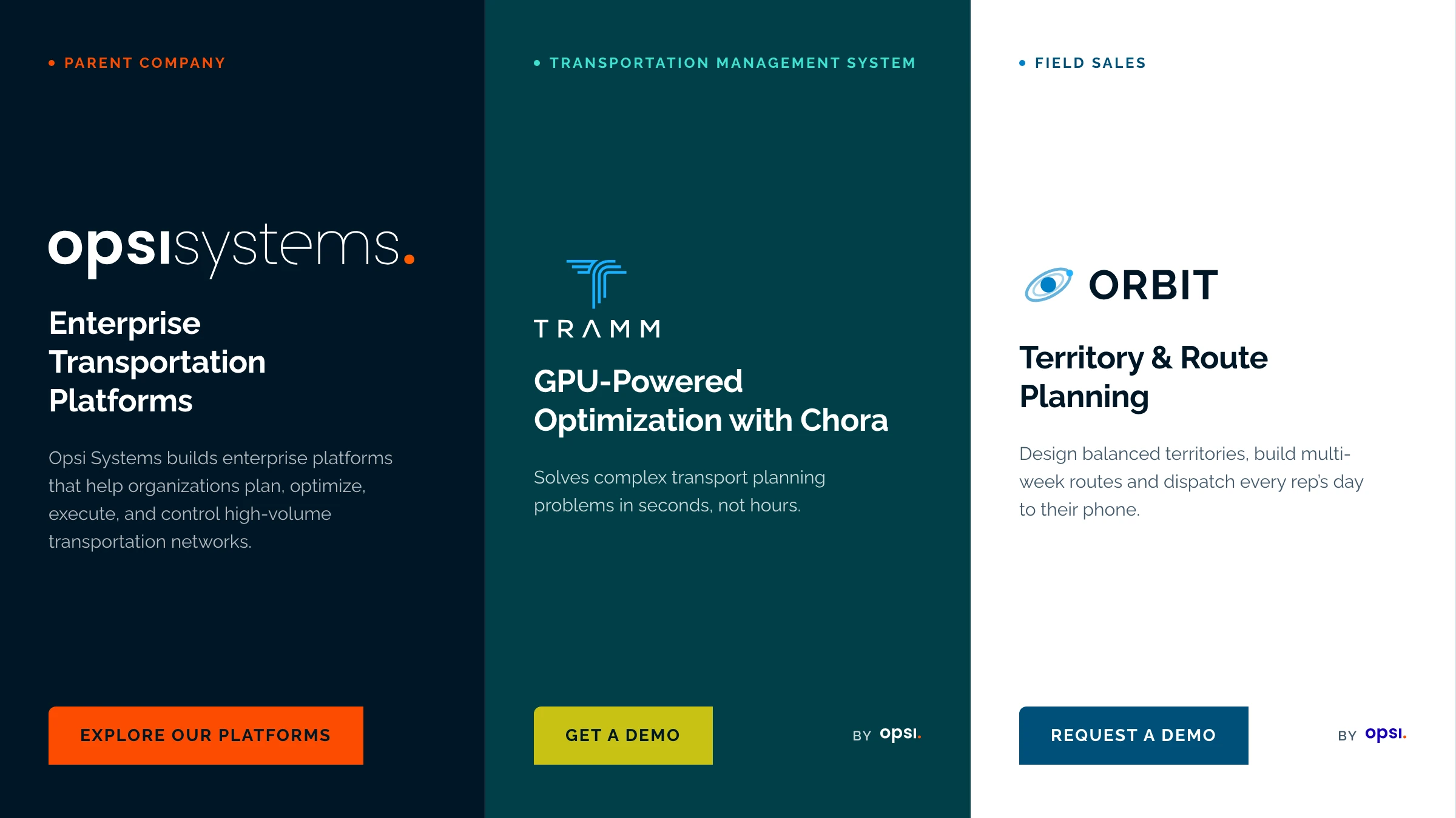
Opsi Systems sells two products, Tramm TMS and ORBIT, with three separate websites (opsisystems.com, tramm.global, orbit3.co) that had grown apart: different corners, buttons, spacing and voice. The products read as unrelated companies, and the parent brand got lost.
If three brands share one base and only differ in logo, ground and accent, every new page, deck or product screen stays on-brand without a designer in the loop.
What I did
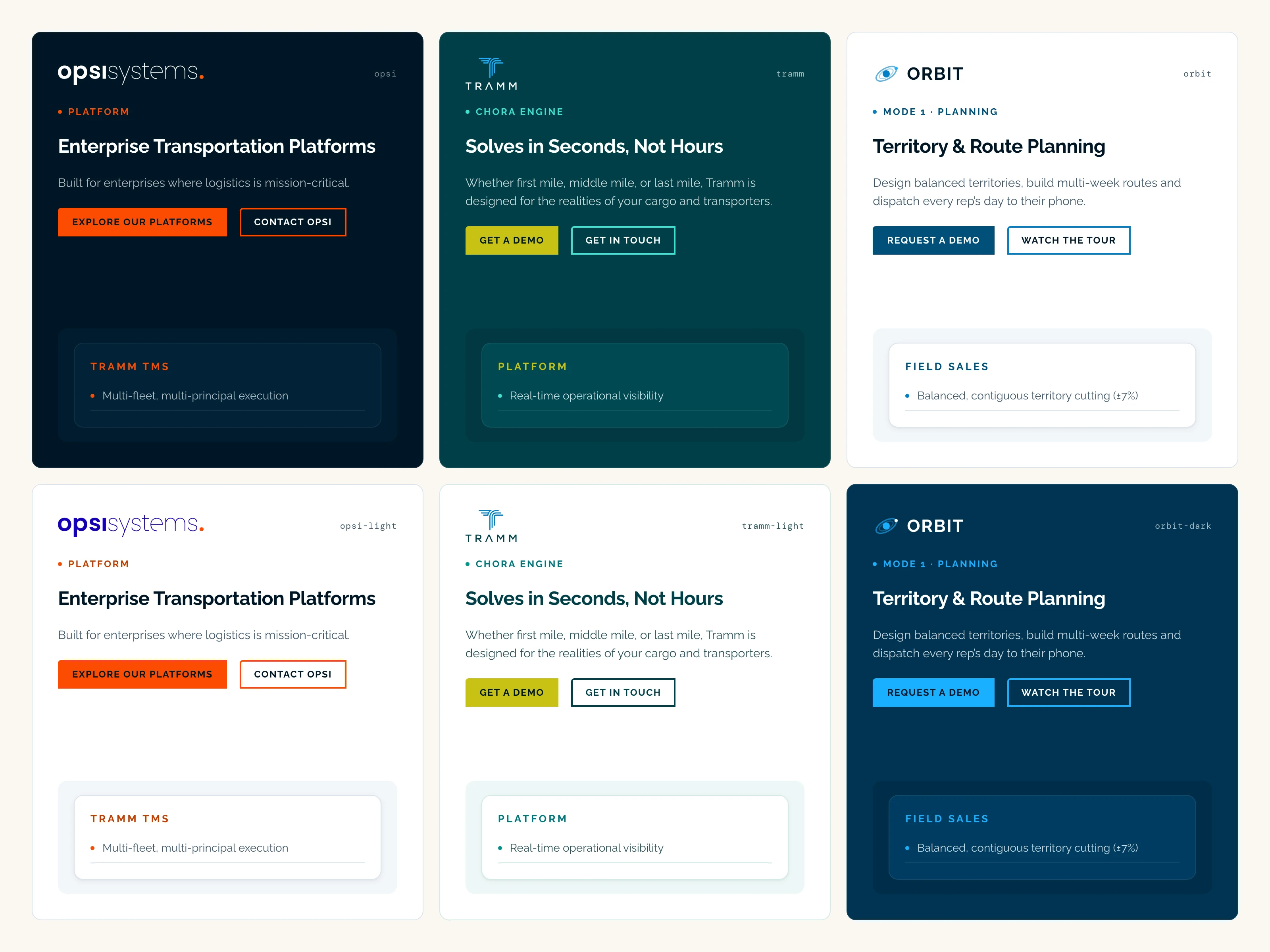
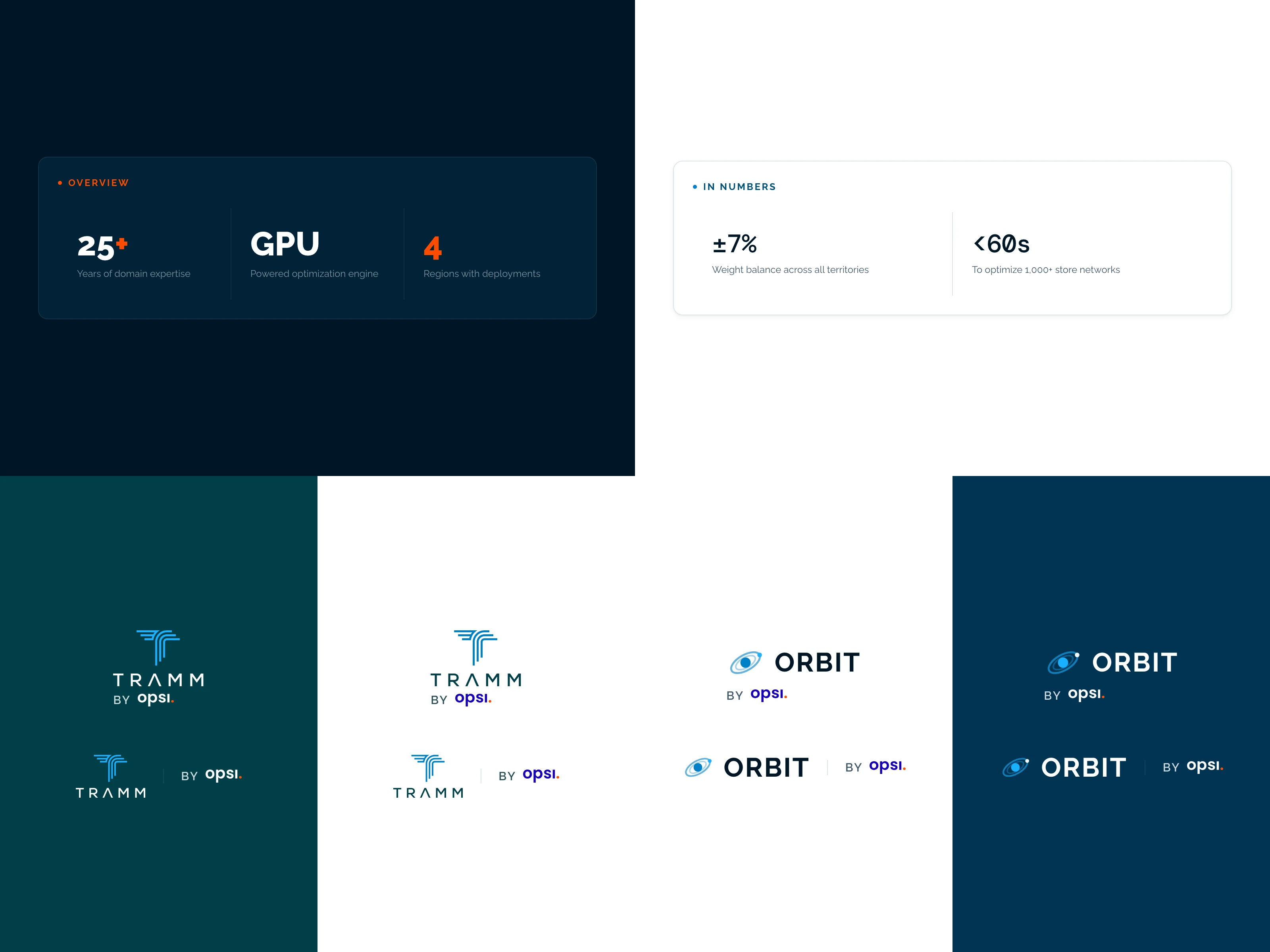
- Brand architecture: Opsi as the parent, Tramm and ORBIT as product brands, tied together with a small "by opsi." endorsement instead of old text credits.
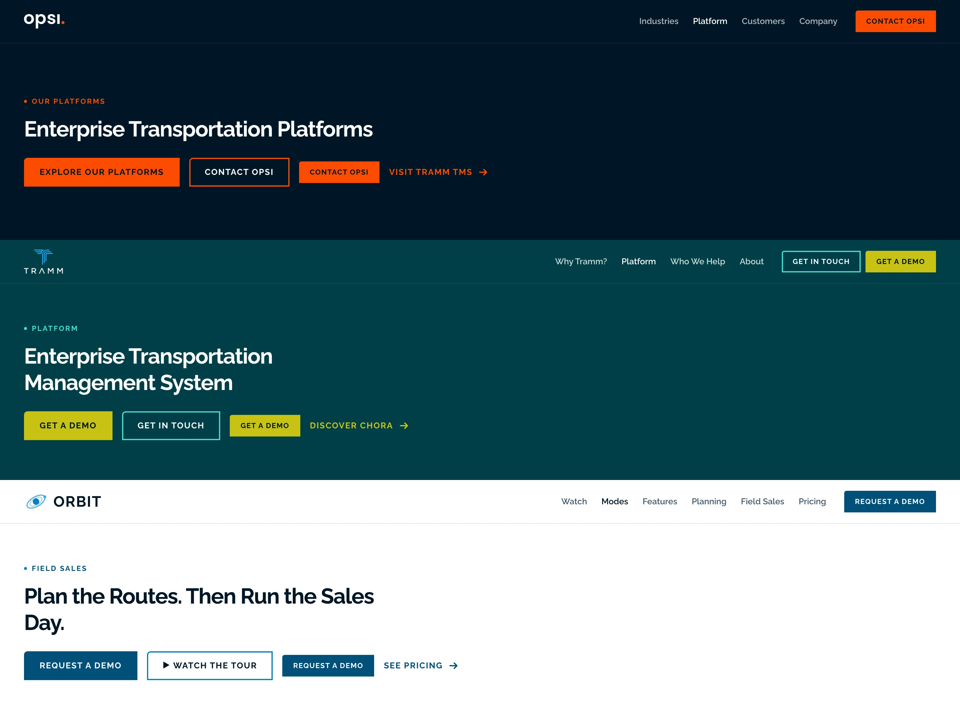
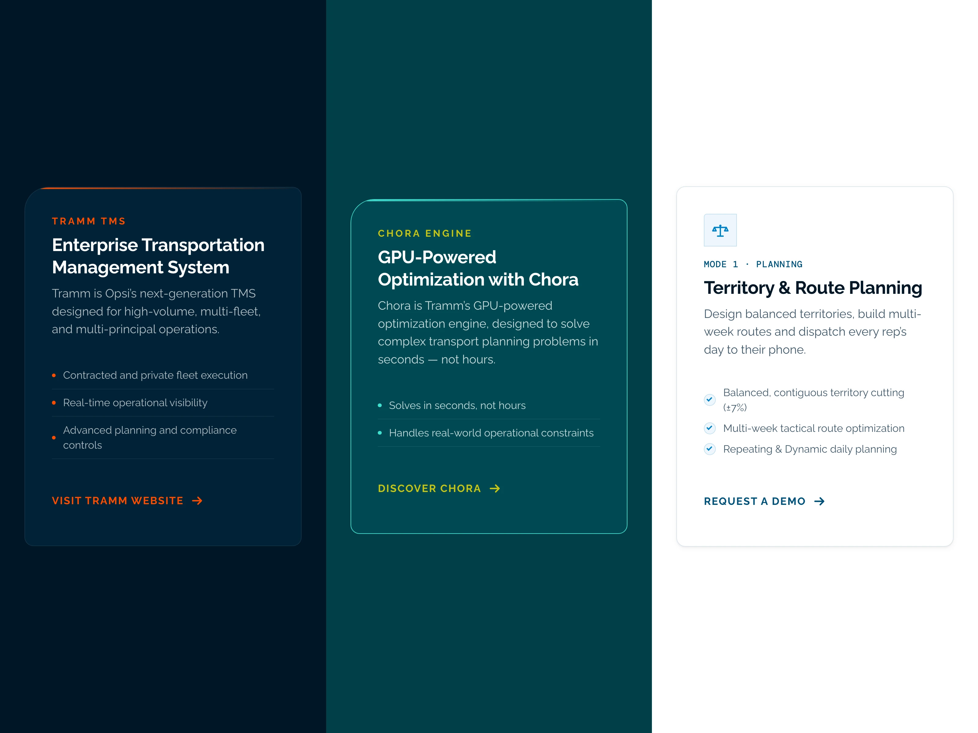
- One shared base: the same type scale (Raleway, DM Mono for data), the family corner (a small top-left cut), one button rule, spacing and components for all three.
- Six themes: each brand gets a home ground and its opposite (Opsi navy and white, Tramm turquoise and white, ORBIT white and deep blue), with every text pair at 4.5:1 or better.
- The dot as the thread: the full stop from the Opsi wordmark starts every eyebrow in every brand.
- Iconography and voice rules for new icons, imagery, patterns and copy across the family.
How it came together
The mark




Palette
Navy · #001626 · Opsi ground and family ink
Kinetic Orange · #FC4C02 · Opsi CTA, eyebrows and the dot
Electric Blue · #1600BA · Opsi wordmark on white
Tramm Turquoise 900 · #003F47 · Tramm ground
Tramm Turquoise · #3FE0D0 · Tramm accent
Tramm Mustard · #C7C214 · Tramm CTA
Light Blue · #19AFFF · the Tramm T and reversed ORBIT accent
Blue · #0080C7 · ORBIT marks and icons
Medium Blue · #00507A · ORBIT CTA
ORBIT 900 · #003352 · ORBIT reversed ground
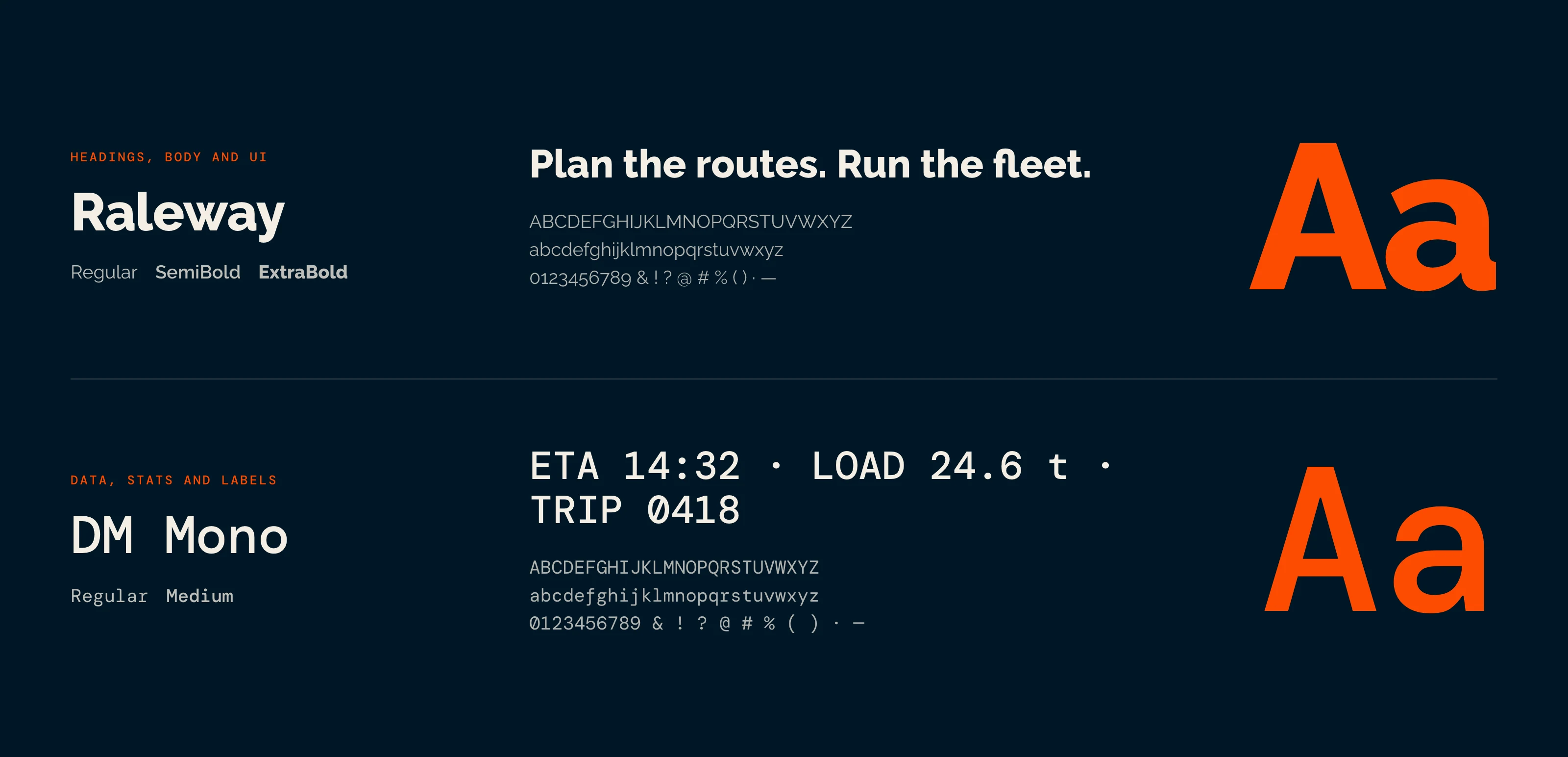
Raleway for everything, DM Mono only for data. Display 72px once per page, 48px section headings, 42px stats. Eyebrows 12px uppercase.
Rules anyone can follow
Swap artwork by ground
Every logo has a version for each ground; the theme picks the right one.
The family corner
A small top-left cut on buttons, tags and featured cards. A notch, never a swoop.
Accent discipline
The accent is for the CTA, eyebrows, the dot, links and one stat. Everything else is navy, white and greys.
Never change shape
Components re-colour themselves per brand but keep the same structure.
The brand at work
On paper
The website
Planning something similar?
Book a 30-minute discovery call, or run the free AI test to see how answer engines read your site today.