Airvantage
Logo and identity for a mobile financial-services brand
The problem
What I did
How it came together
The brief
Airvantage works where telecoms meets finance: airtime advances, mobile financial services and financial data for people without a bank account. It sells to mobile operators and serves their customers, so the logo had to look credible to both.
What I did
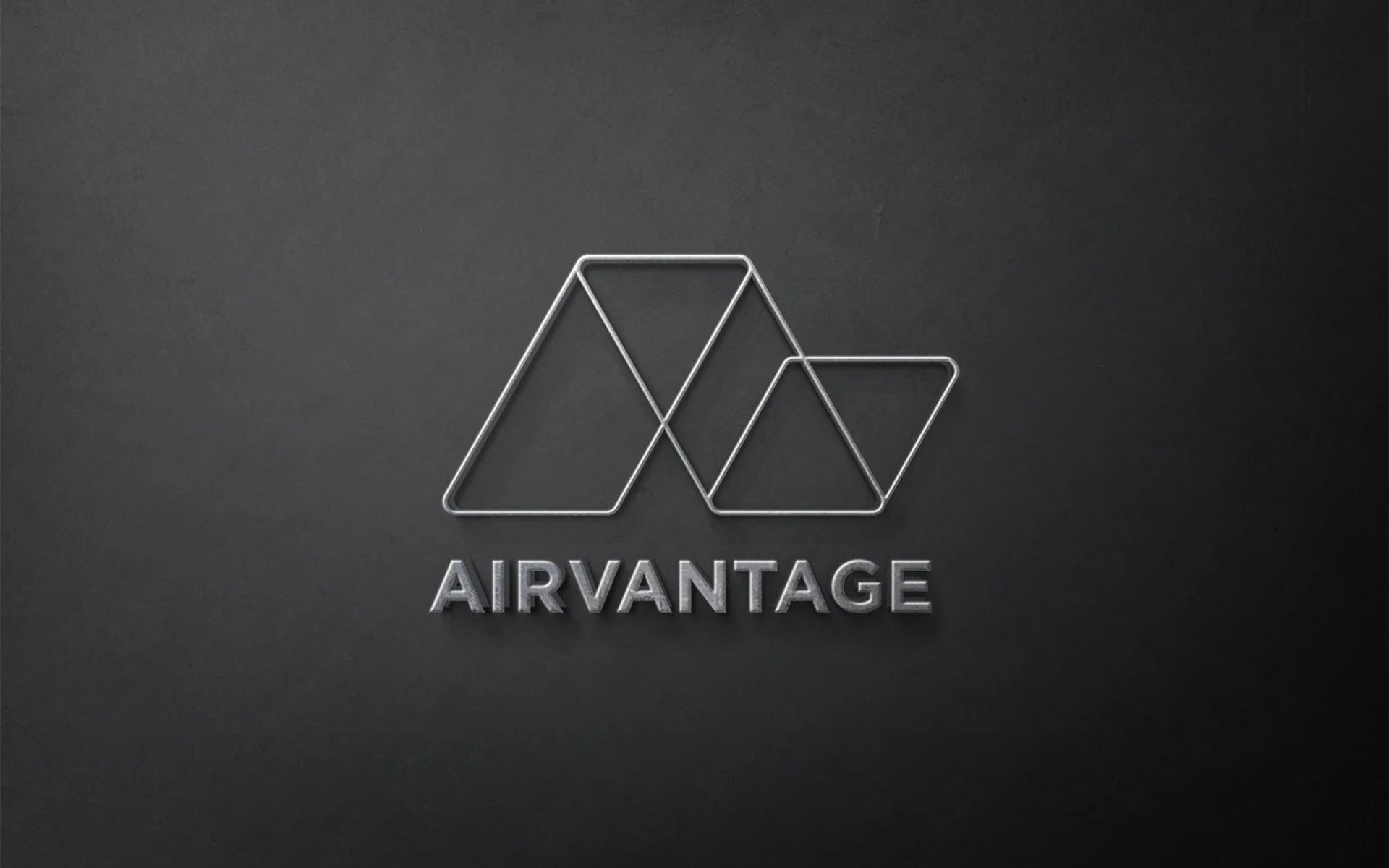
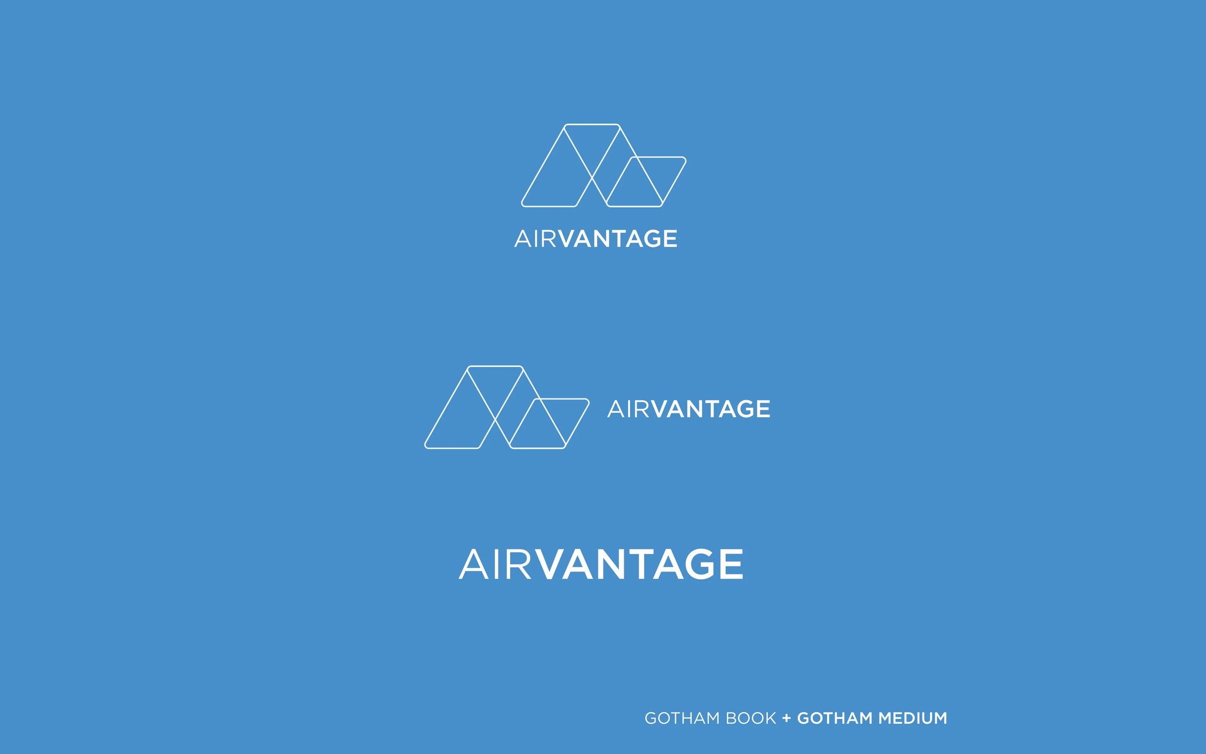
I explored several directions and settled on a geometric mark of linked outline triangles. It suggests connection and lift, and it reads as the A in the name.
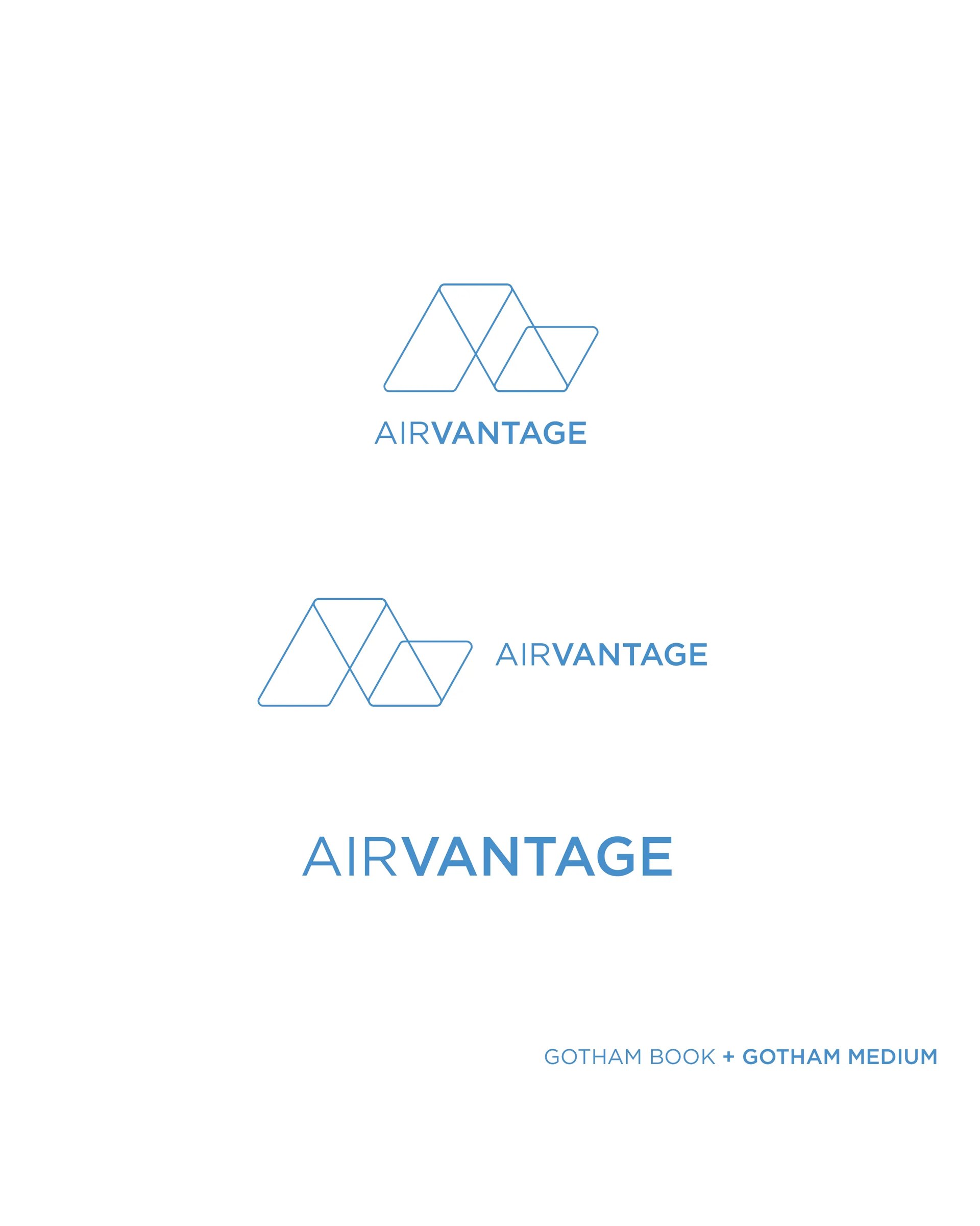
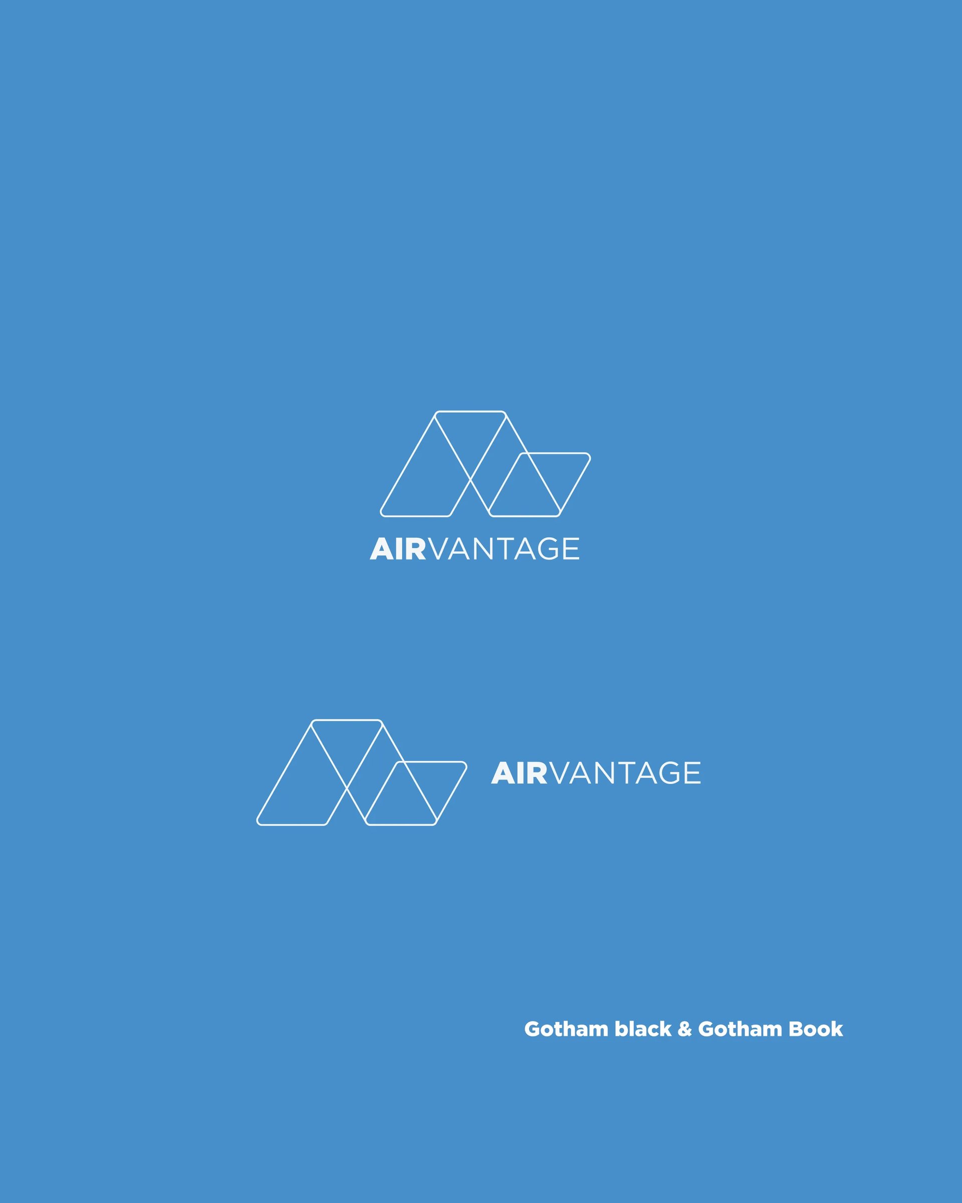
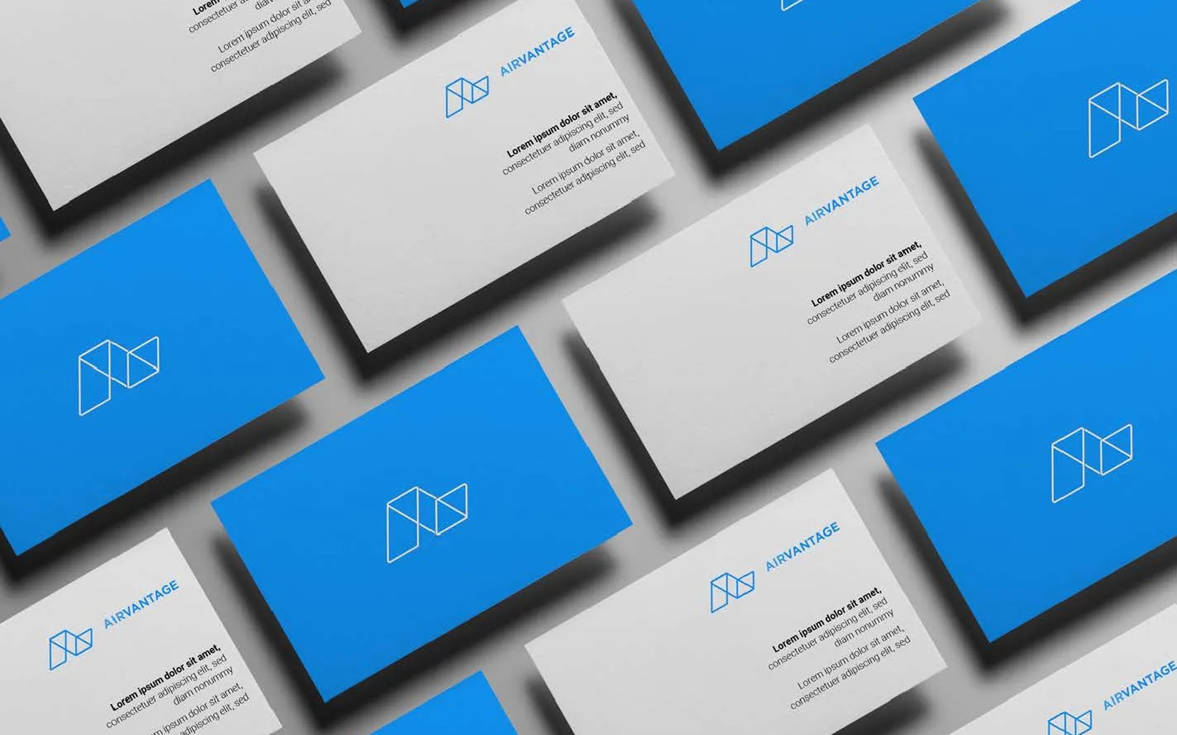
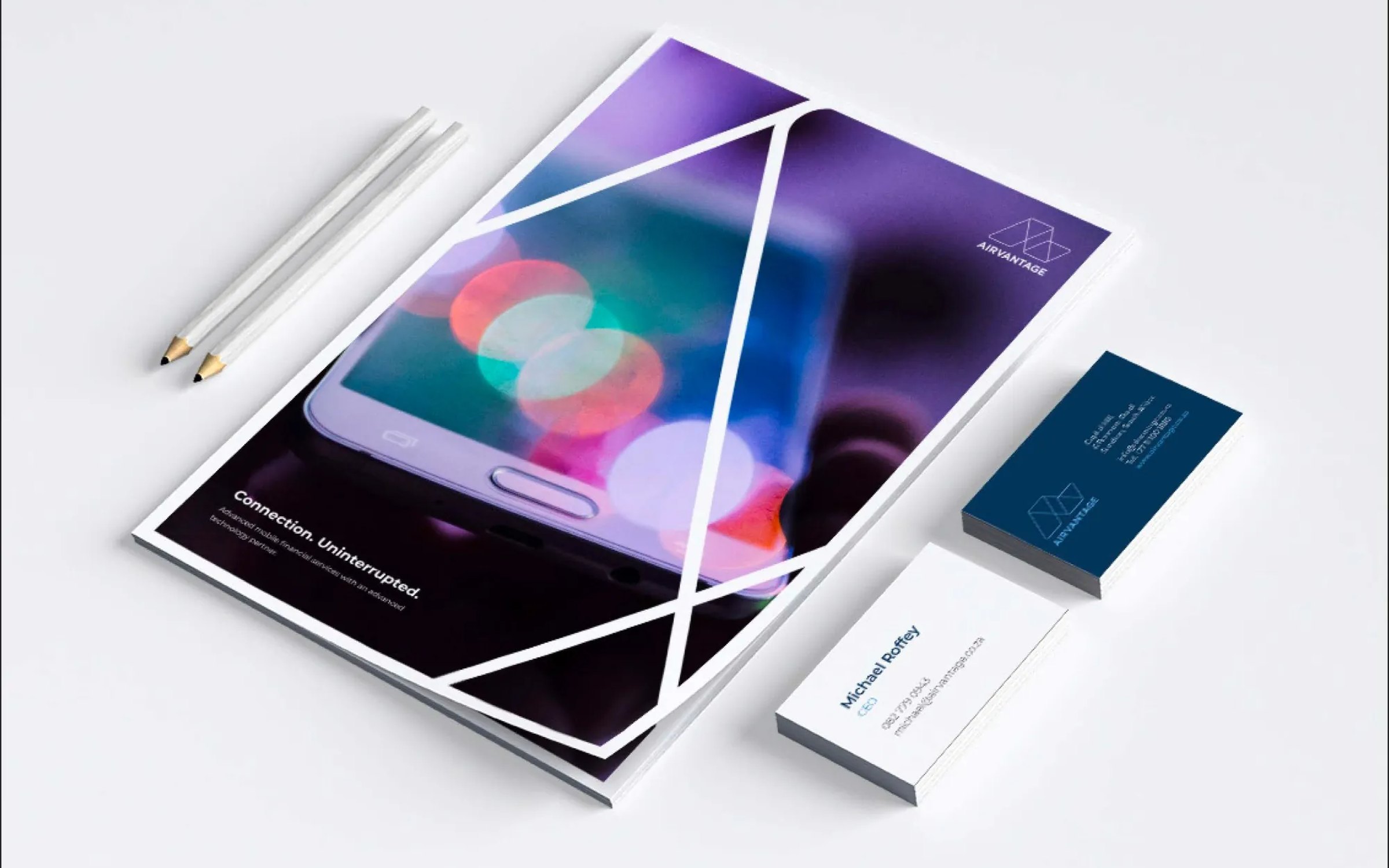
The wordmark pairs Gotham Book with Gotham Medium, so “Air” and “vantage” read as two parts of one word. I drew horizontal, stacked and icon-only lockups, each in blue, white and outline versions, and applied them to business cards and letterhead.
The outcome
A simple mark that holds up at app-icon size and on a sign, with a full set of lockups for any format. More of my logo and identity work is on the branding page.
The mark
The brand at work
On paper
In the feed
The website
Planning something similar?
Book a 30-minute discovery call, or run the free AI test to see how answer engines read your site today.