A B2B web design agency for ambitious B2B leaders.
Websites and AI products that get cited by AI search, not just ranked by Google.
Clutch Rating
Client Retention
Years in B2B
Webflow Partner
Lab Results
High-performance builds for ambitious B2B brands.
Most B2B websites look the part — and stop there.
Beautiful design isn't enough. Your website should be your highest-performing sales asset — converting visitors, ranking in AI search engines, and scaling with your brand. We build Webflow sites engineered for measurable B2B impact.
When teams call us
Six signs you've outgrown your current website
Mid-market B2B teams rarely rebuild a site for fun. They rebuild because something underneath the business changed — and the site is now in the way.
You just raised — or are about to
New funding raises the bar overnight. Investors, hires and enterprise buyers are landing on a site that reflects the old you, not the company you're now expected to be.
You've repositioned, the site hasn't
Pricing changed. ICP shifted up-market. New product line, new category. The messaging on the site is still last year's pitch — and sales is editing decks to compensate.
Pipeline has plateaued
Traffic's fine, conversion isn't. Demo requests are flat or declining. The funnel leaks somewhere between landing and book-a-call — and you can't A/B your way out of it.
You're invisible to AI search
Buyers are asking ChatGPT, Perplexity and Google AI Overviews for shortlists in your category. Your competitors show up. You don't. In 2026, that gap compounds weekly.
Every change needs a developer
Marketing wants to ship a landing page on Tuesday. Engineering says next sprint. The CMS is a black box, the design system is broken, and small edits become two-week tickets.
M&A or a rebrand is on the table
Acquisition, merger, parent-brand consolidation, full rebrand. The site has to carry a new identity, new products and (often) new domains — without losing organic equity.
Recognise two or more? It's probably time for a conversation.
How we choose your stack
Three ways we ship for ambitious B2B teams
We're tool-agnostic. The right stack depends on who edits the site, what it has to do, and where AI search fits in.
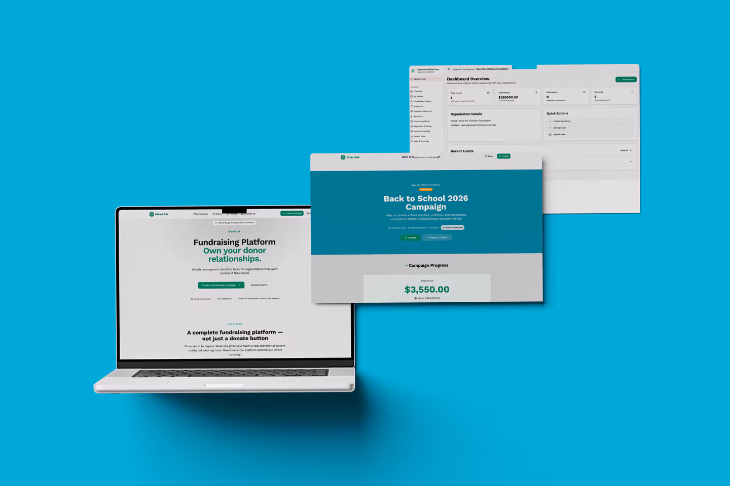
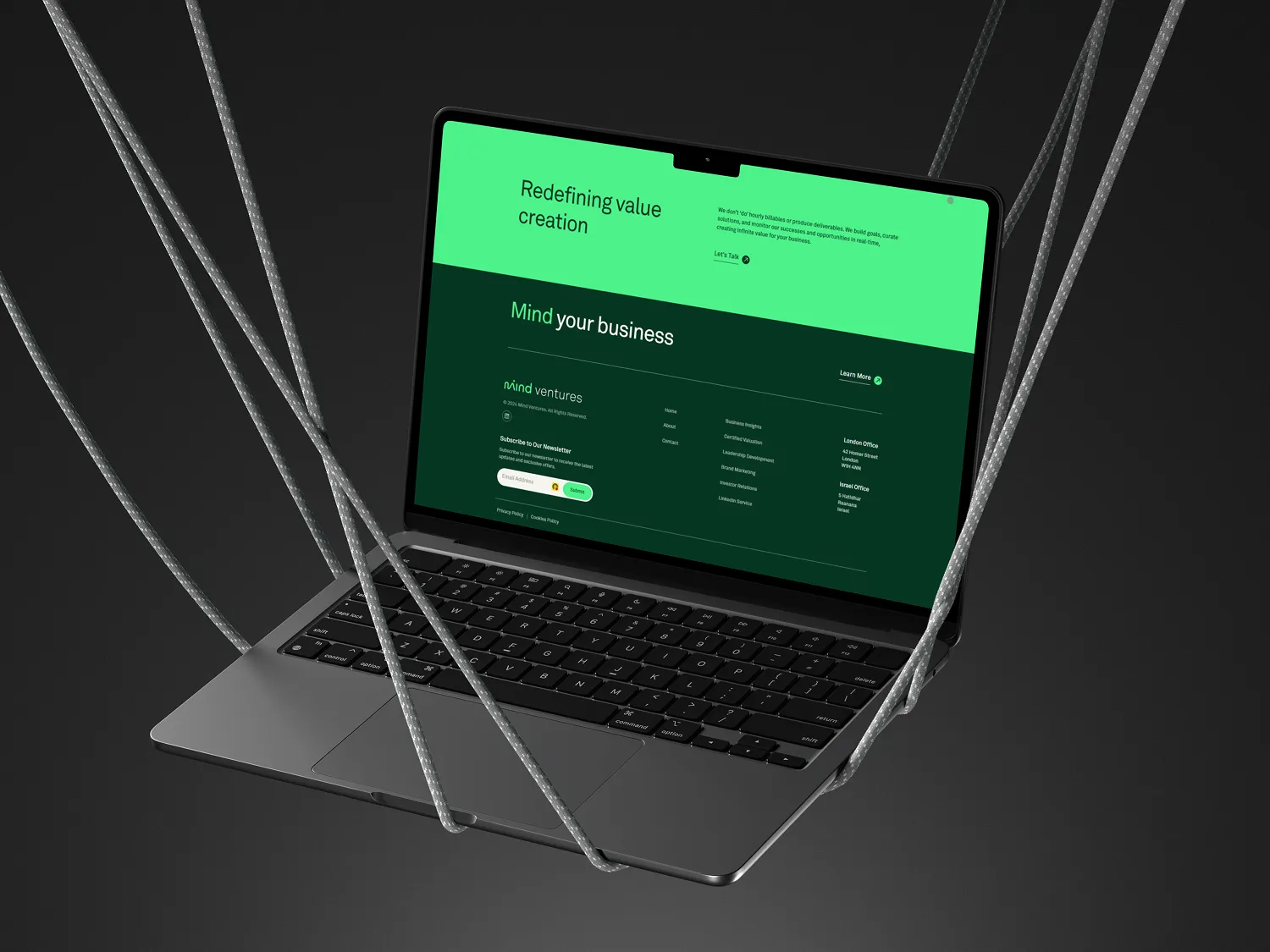
Webflow
Marketing-team autonomy
Best when
- ·Marketing edits weekly without dev
- ·Content & CMS-heavy site
- ·Fast launch, low overhead
- ·SOC 2 hosting out of the box
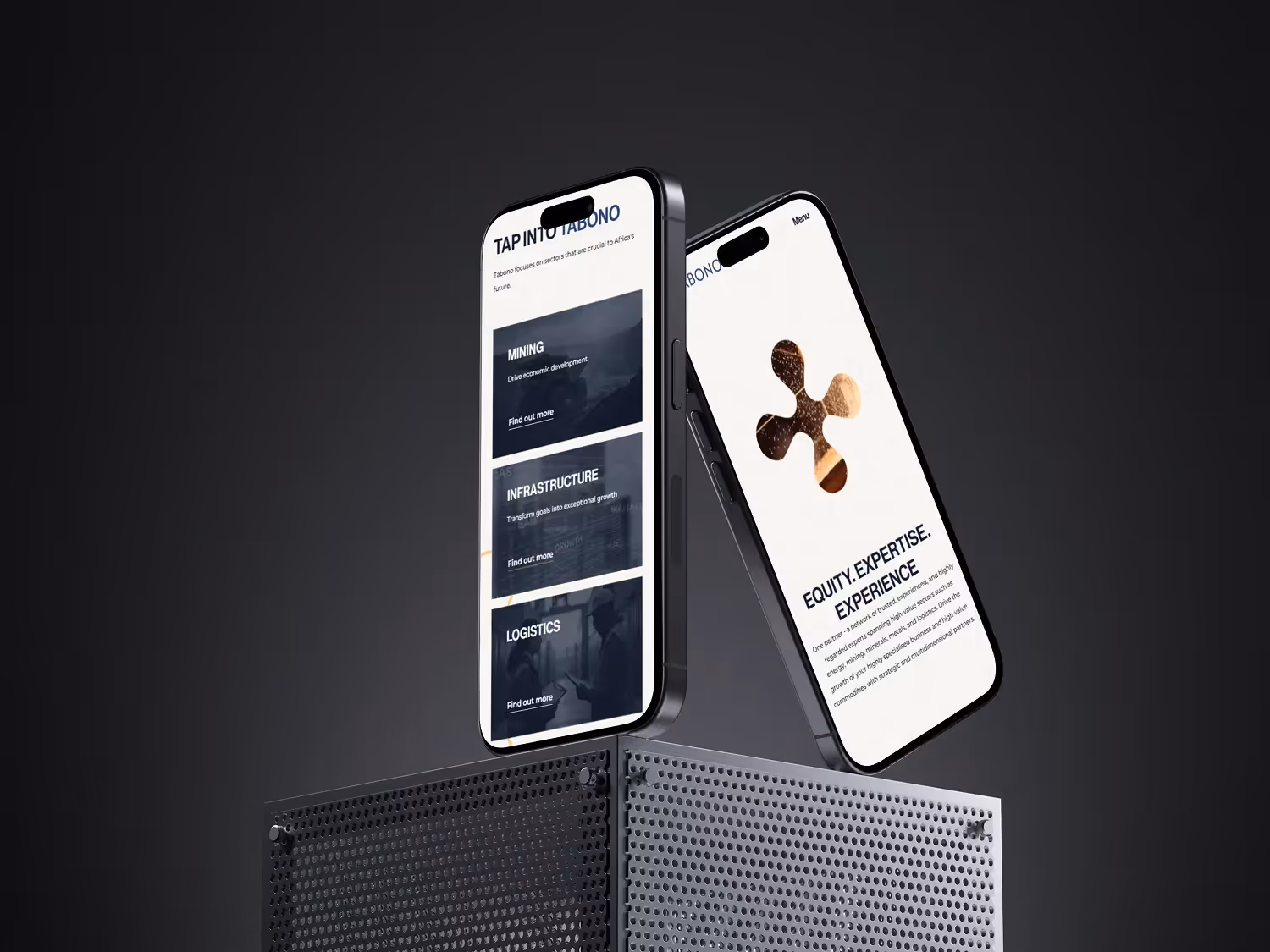
AI-Native React
Built for AI search
Best when
- ·AEO + AI search is mission-critical
- ·Product-led, custom UX flows
- ·Modern React + headless content
- ·Full code ownership, host anywhere
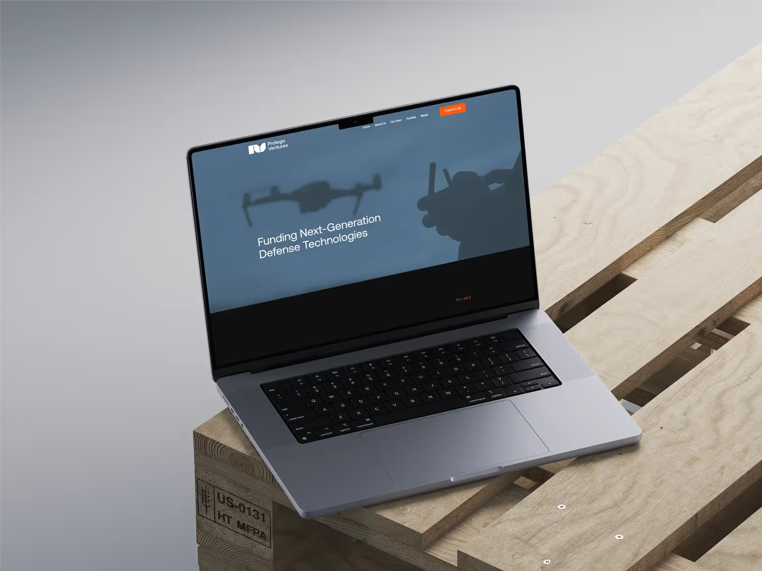
Custom AI Products
Copilots, agents & RAG
Best when
- ·Internal copilots & ops automations
- ·AI features inside your SaaS
- ·RAG, agents & LLM gateways
- ·Ship in weeks, not quarters
Not sure which fits? That's our first conversation.
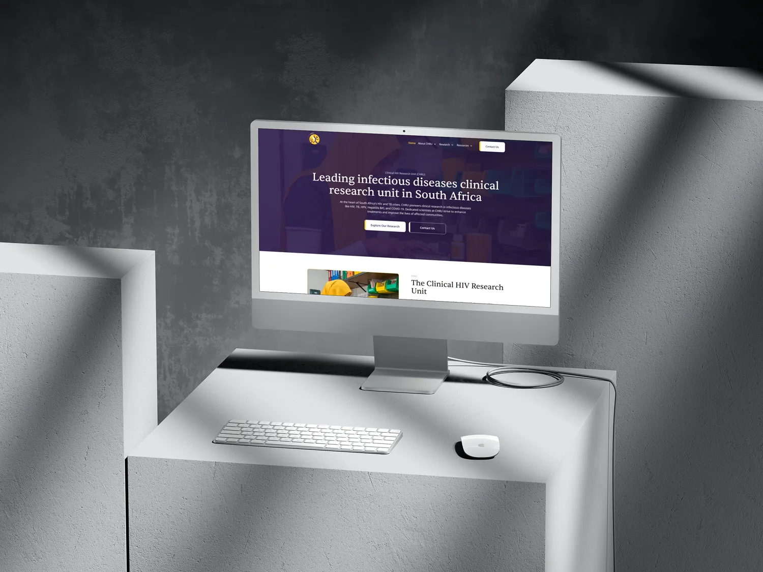
Trusted by ambitious B2B teams
4.9 rating on Clutch from clients across Europe, the US and Africa.
"BrandingLab is a Webflow expert with technical competence and brilliant design services."
Michelle K Blumenau
Director, Turquoise PR & Marketing Communications
"They delivered excellent quality and had an impressive ability to implement my vision."
Jo Eyre
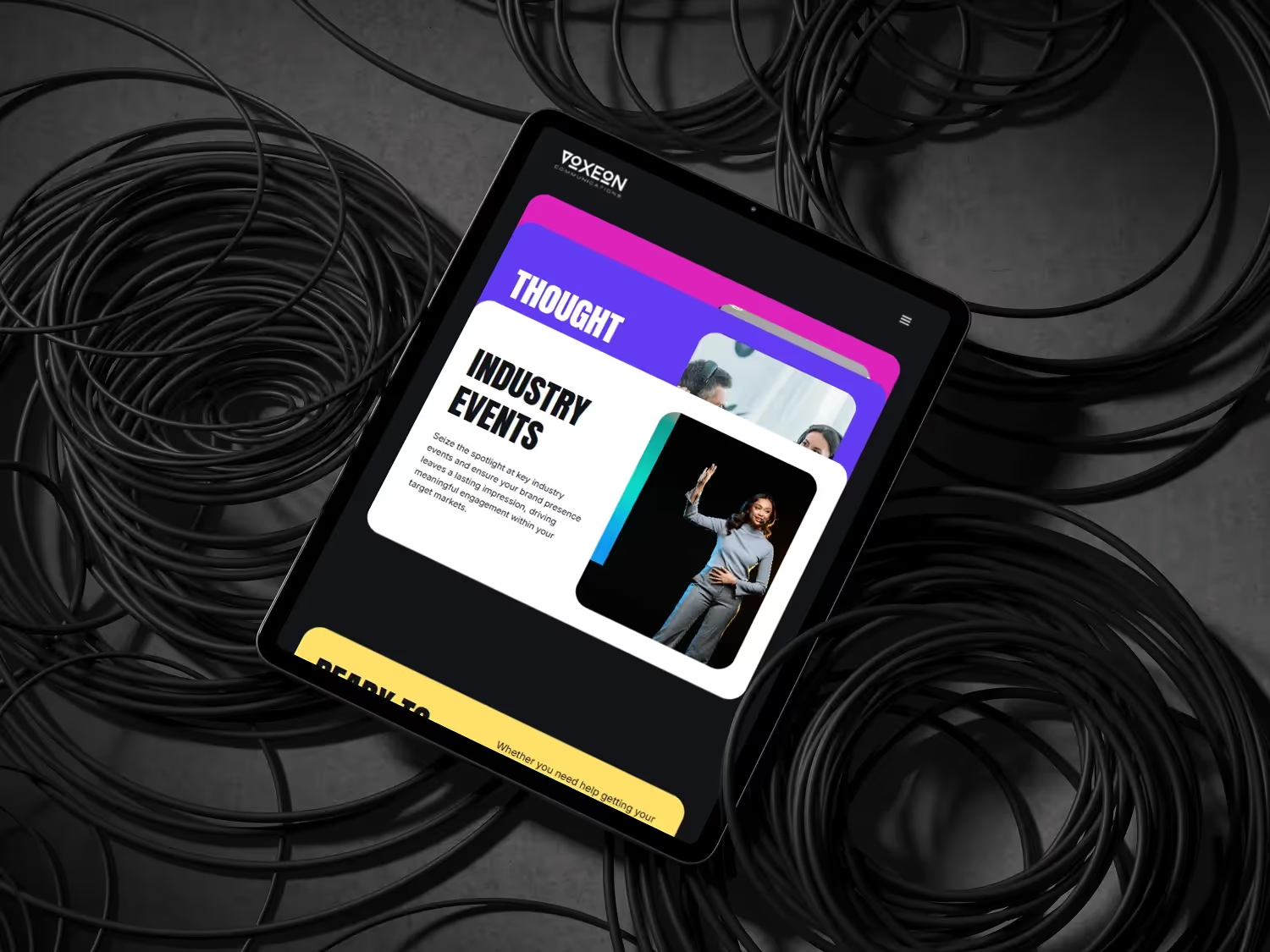
Managing Director, Voxeon Communications
"We were impressed with their personal touch and speedy turnaround times."
Director
Witz Inc (Legal)
"Their project management was seamless and very professional."
Arthur Liegeois
Manager, Arthur Strategy Design
"BrandingLab made good suggestions on interactions and features, which raised the level of the site experience."
Caryn Sher
Director, Jack Be Nimble
"Their response time was very efficient."
Adam Levin
Founder, Brandsmiths
Our Partnerships
We partner with the best tools and platforms to deliver exceptional results.
Webflow
Accredited Agency Partner
Clutch
5.0 Rated — Top B2B Agency
Claude
AI-Powered Development
Lovable
Modern Dev Tooling